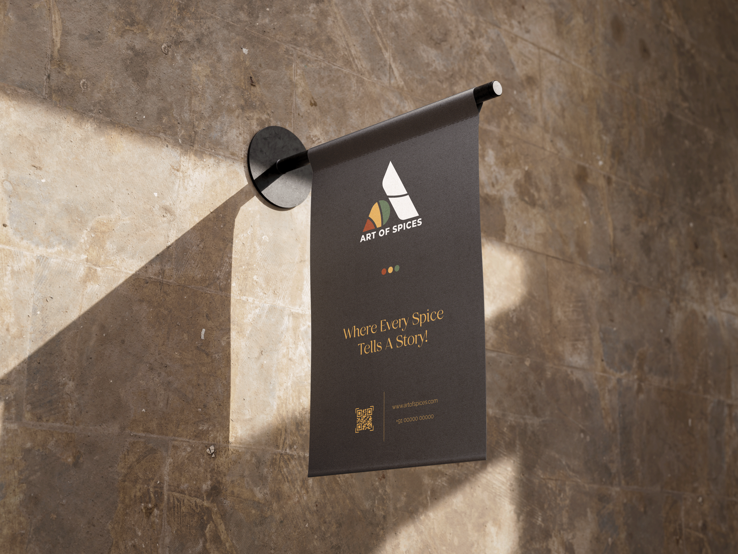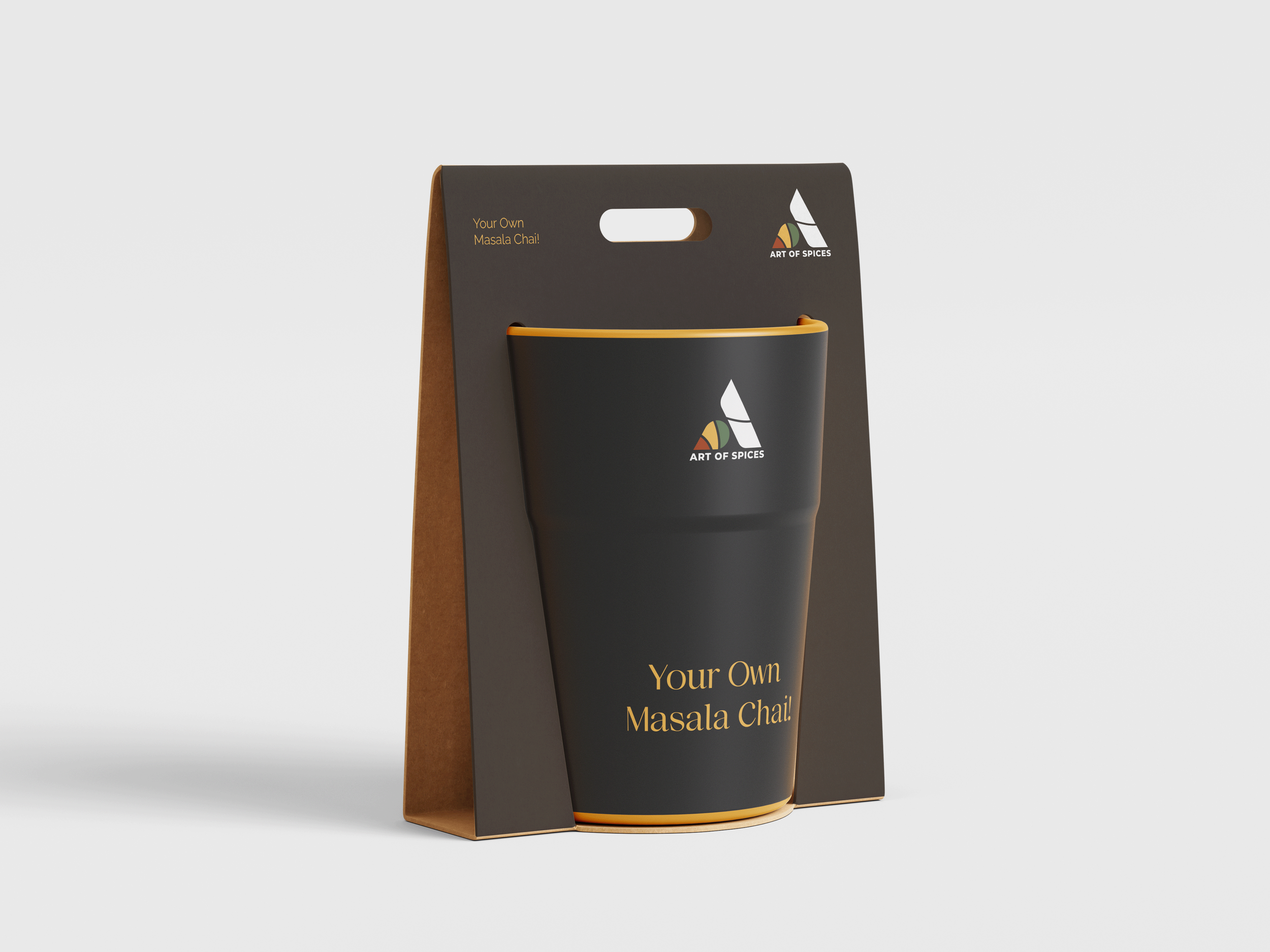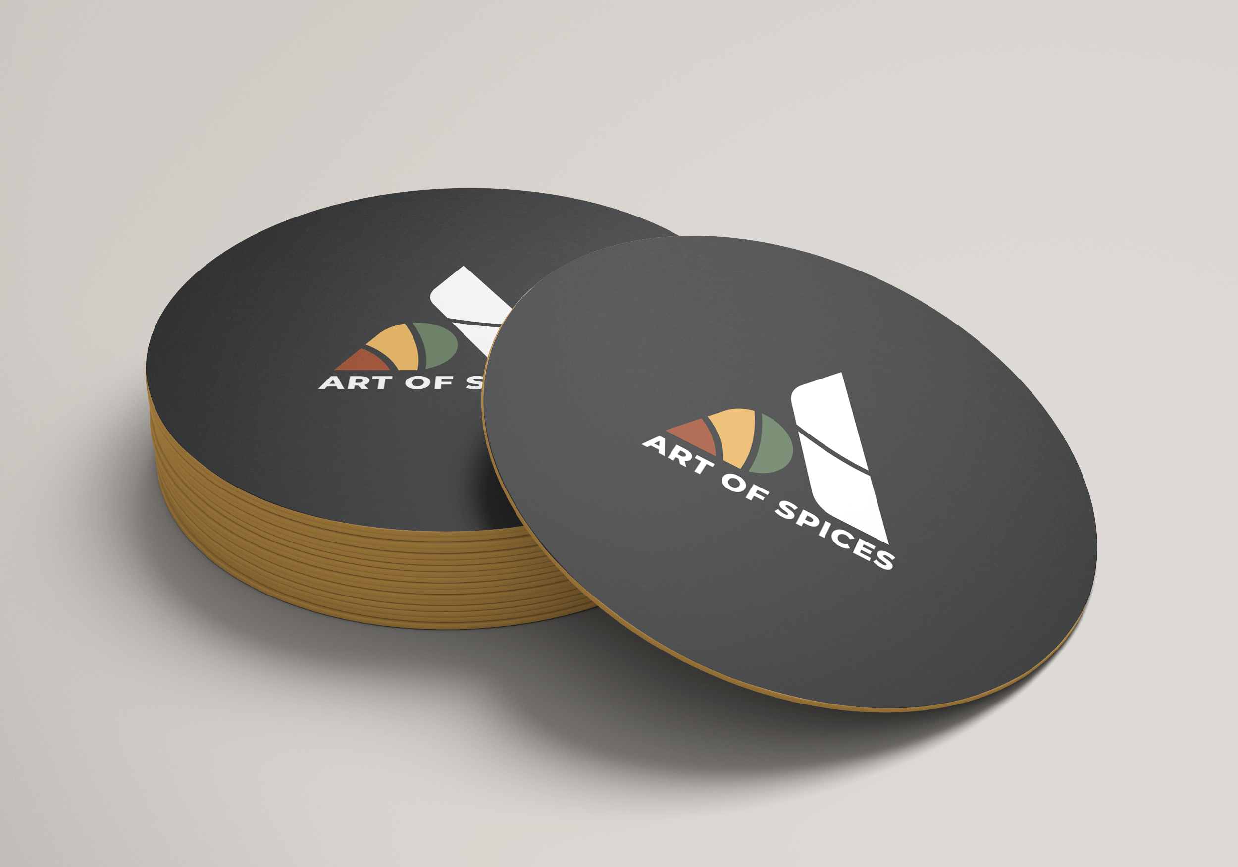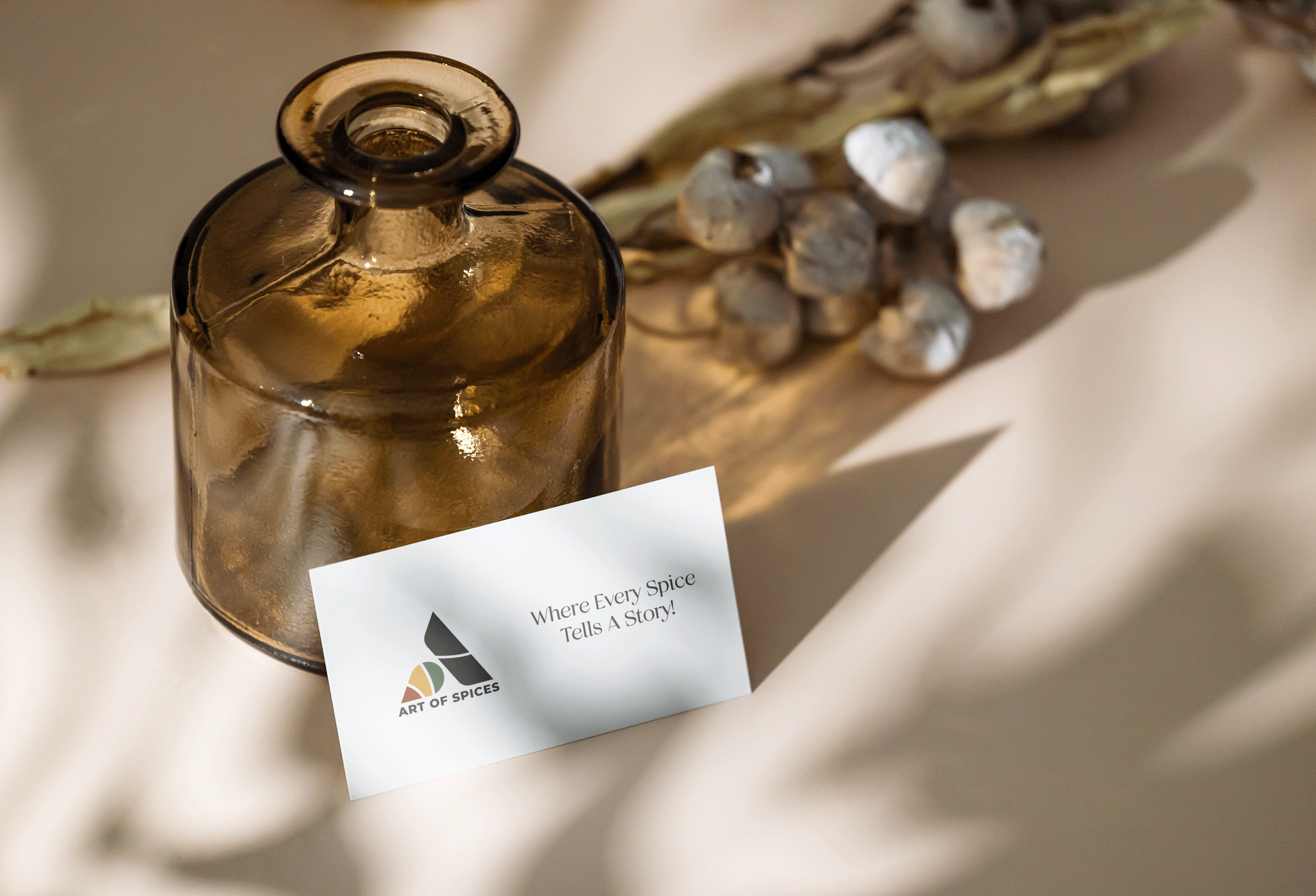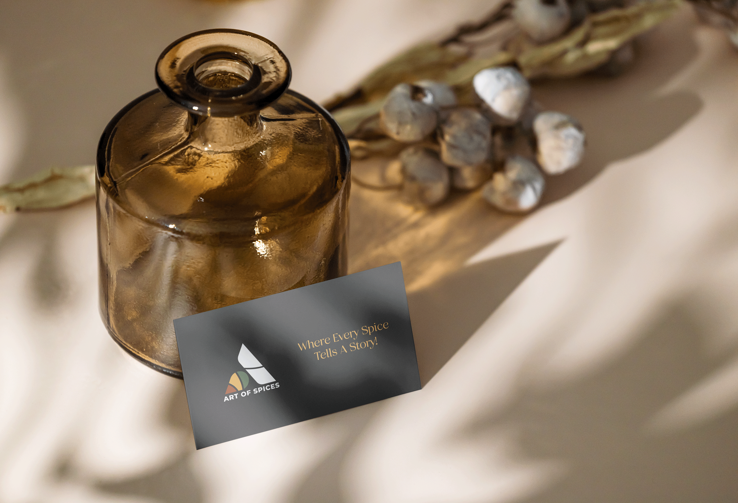
Art of Spice is a spice brand identity built as part of a wider set of logo work produced alongside an architectural engagement.
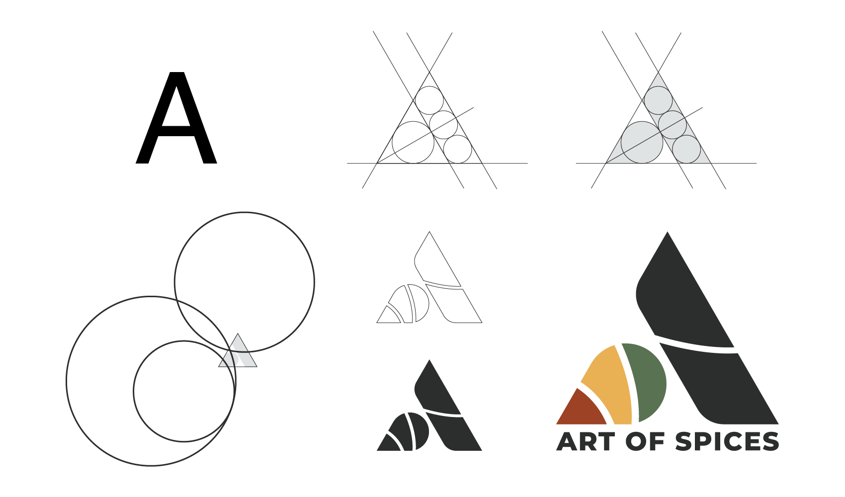
The mark is built from the letter A. The right arm is a bold angular stroke that carries the structure of the form. The left side transforms into a spice box: three curved partitions in terracotta, turmeric gold, and herb green, each colour drawn directly from the spices the brand works with. The central dot marks the division between the two halves, where the geometry of a letterform meets the visual language of the product.
The wordmark sits below in a clean condensed bold, letting the icon carry the character and the type carry the clarity.
The logo was built for application and went to print as a billboard.
Brand Language
*
Brand Language *