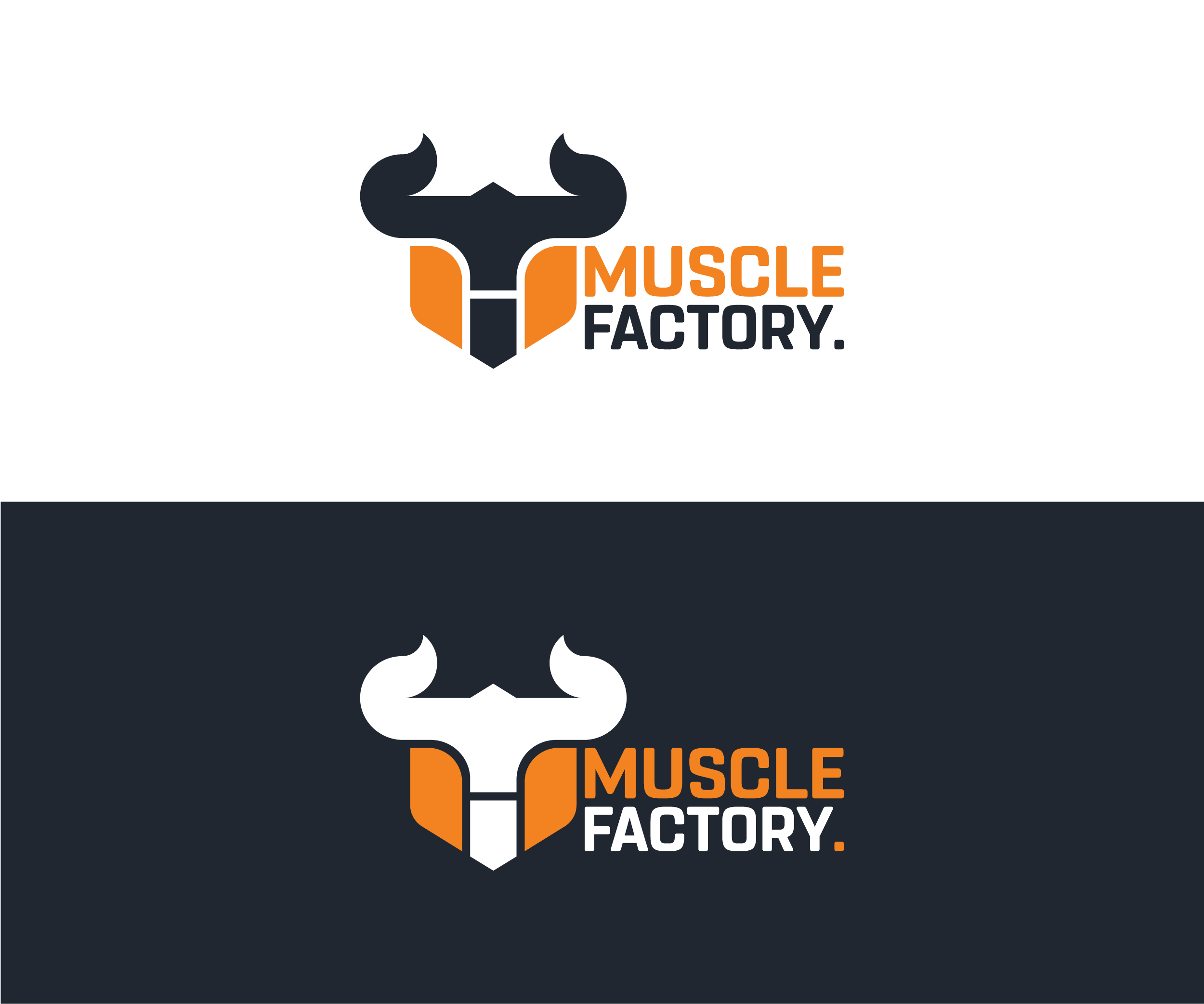
Muscle Factory is a gym brand that needed a mark with the same weight as the name carries.
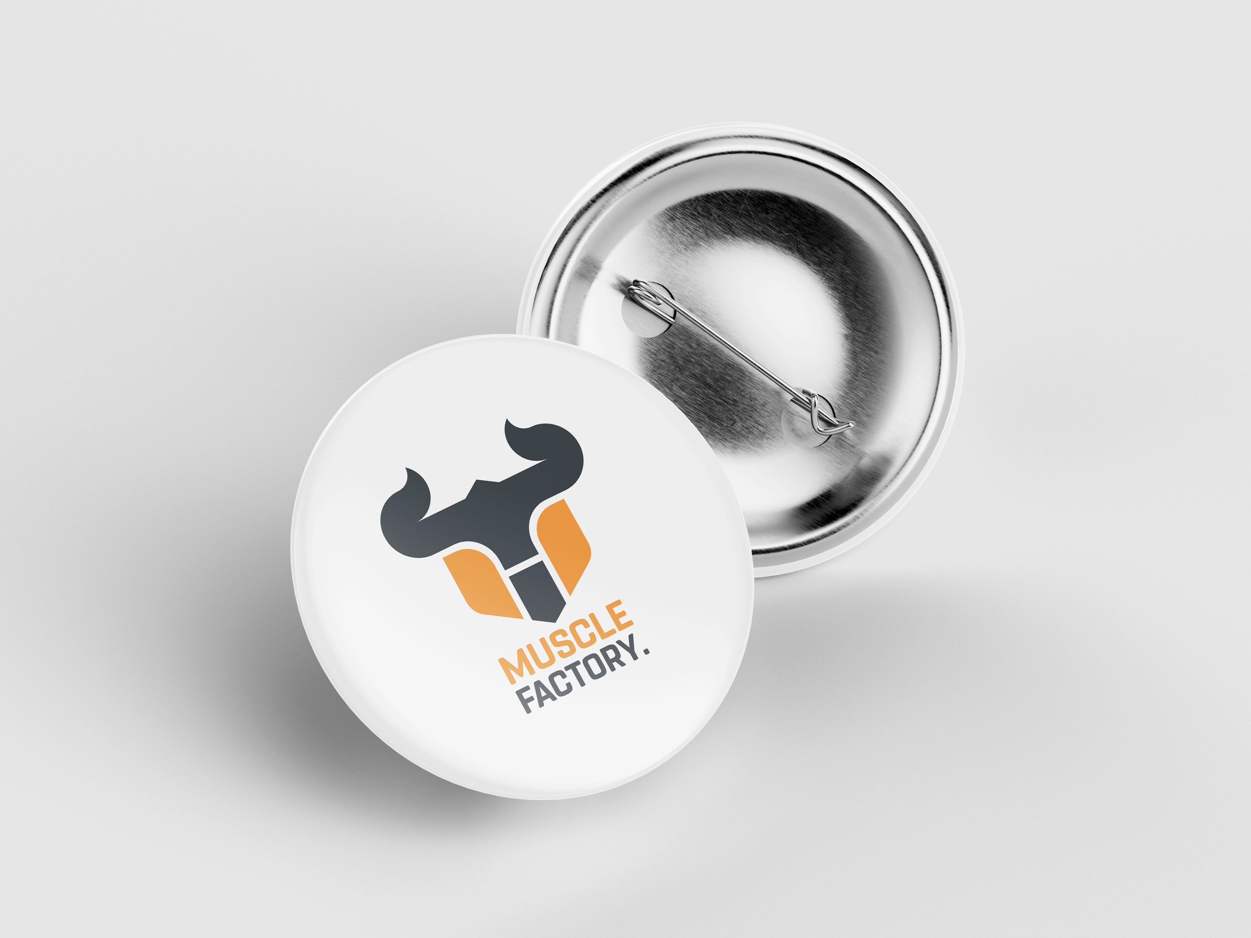
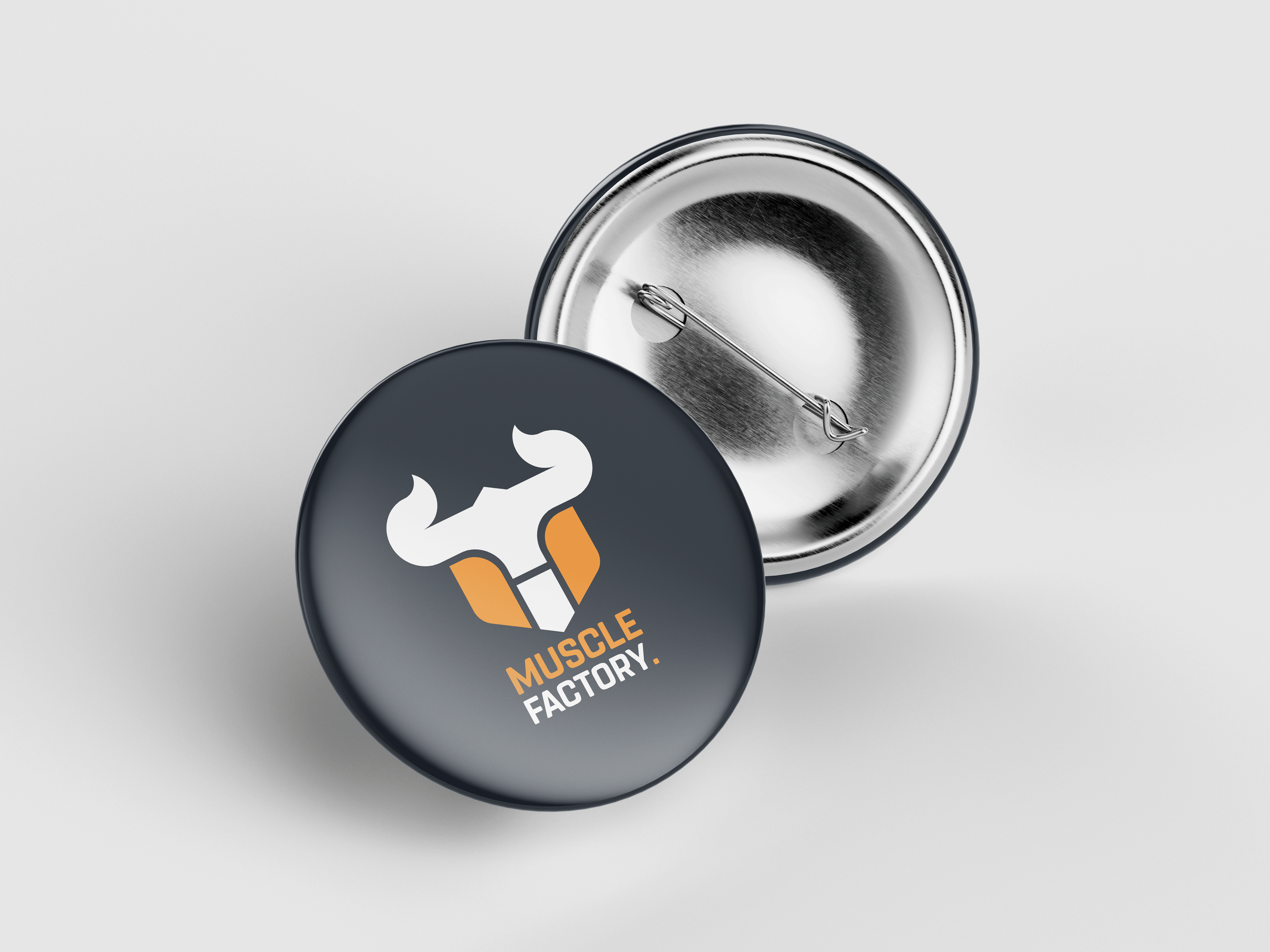
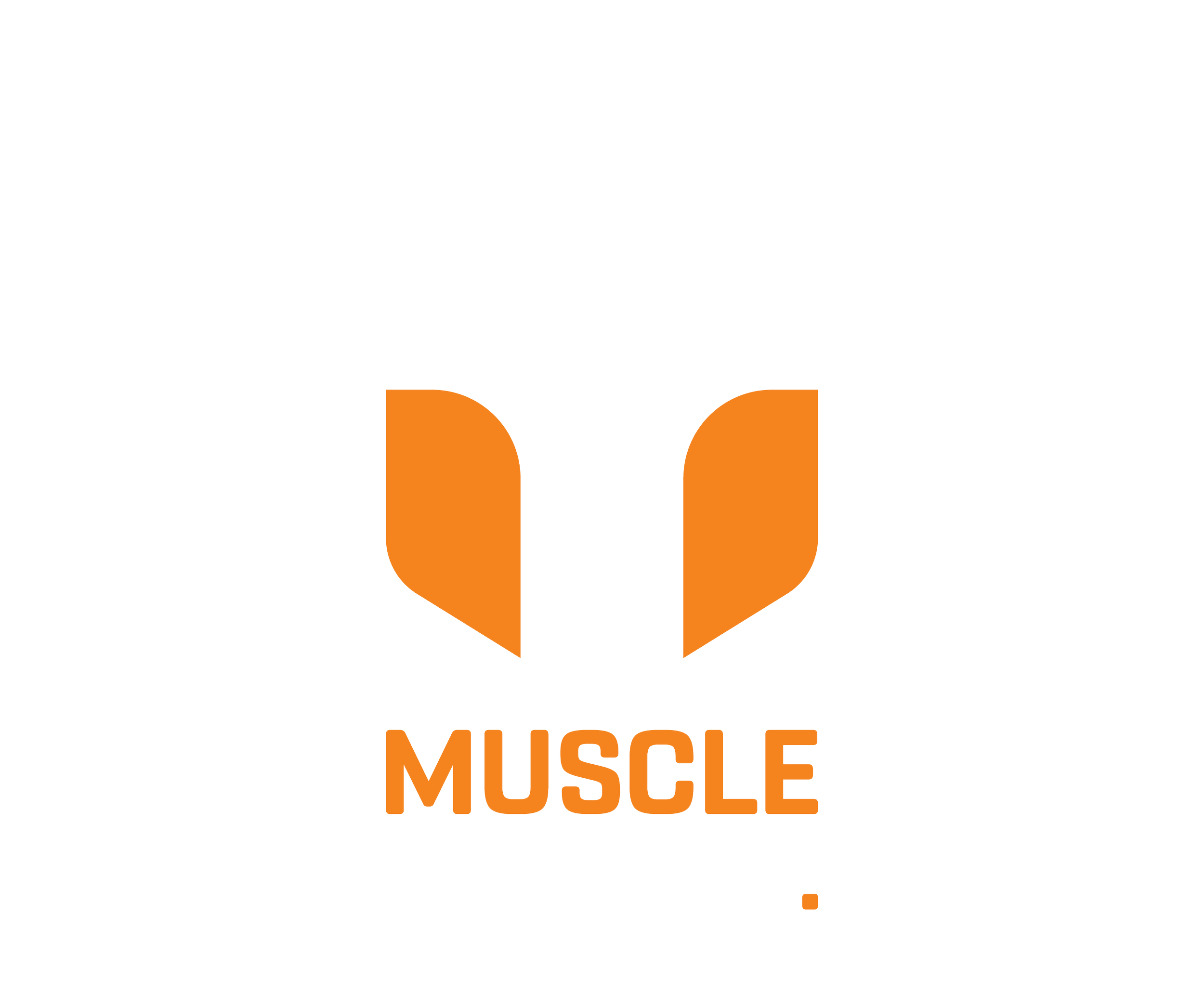
The icon reads two ways simultaneously. A bull from above, horns wide and dominant. A muscular torso from below, the orange form of the chest and shoulders framing a white negative space that anchors the whole mark. Both readings arrive at the same place: strength, physical presence, and controlled aggression.
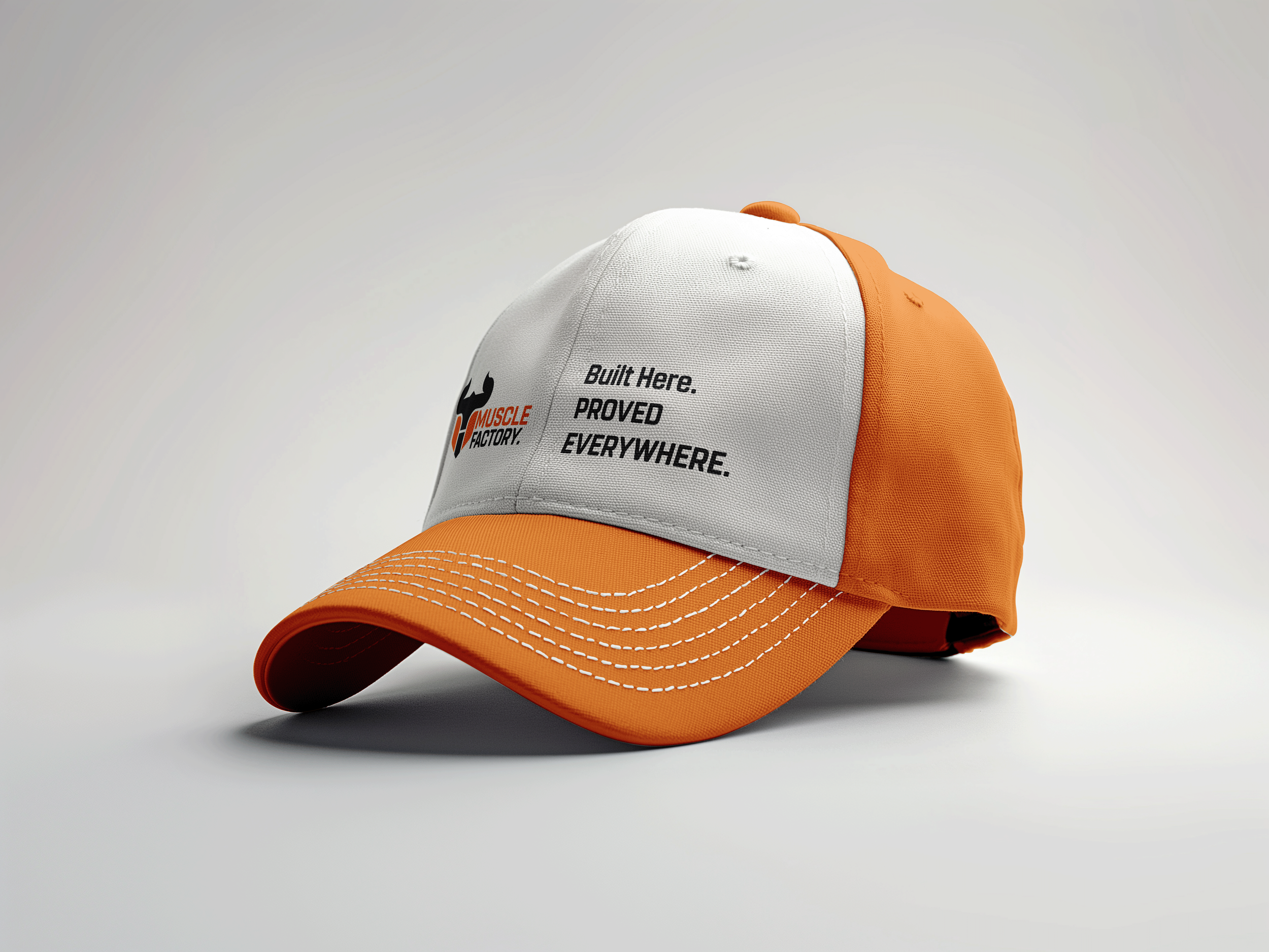
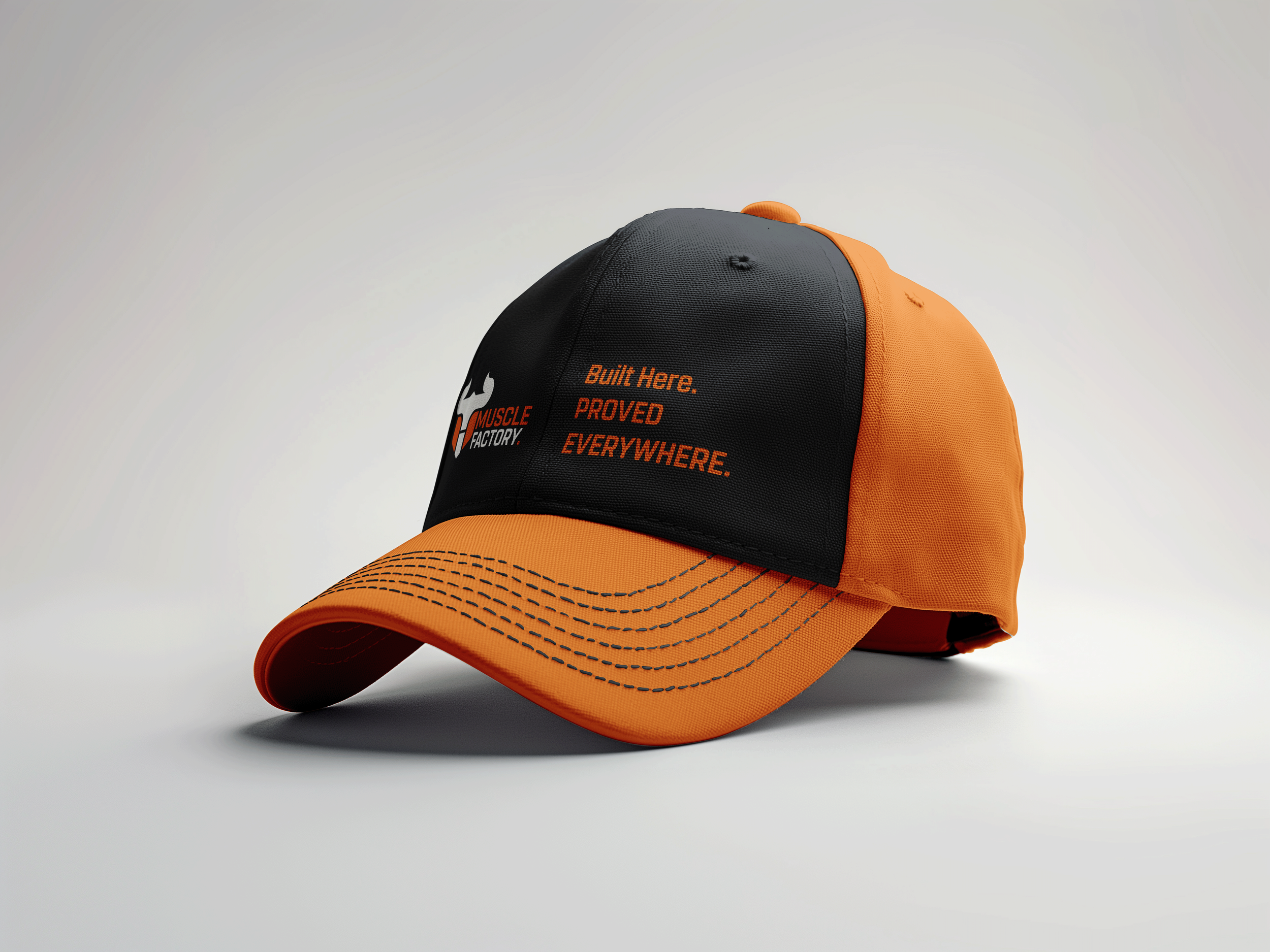
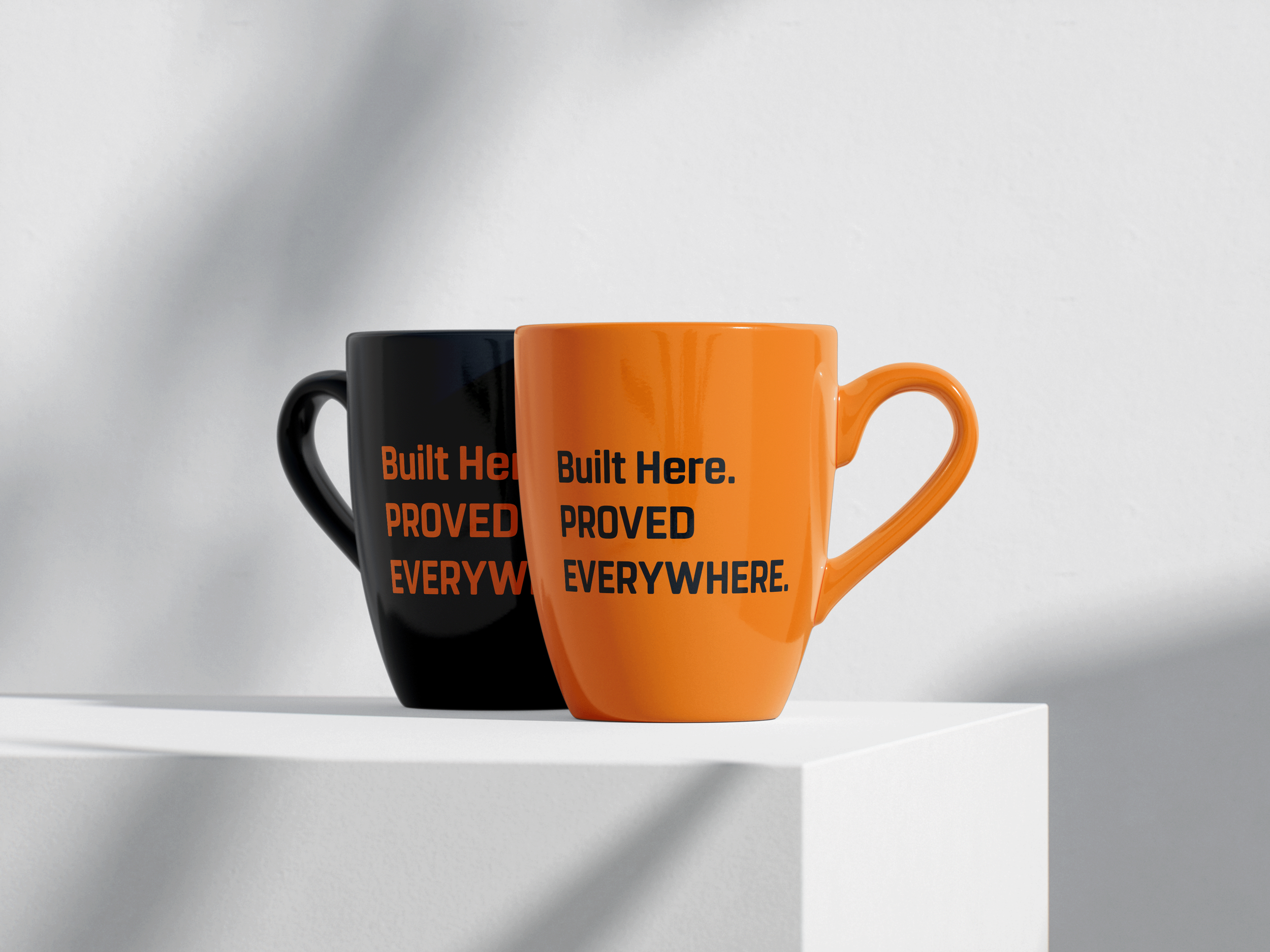
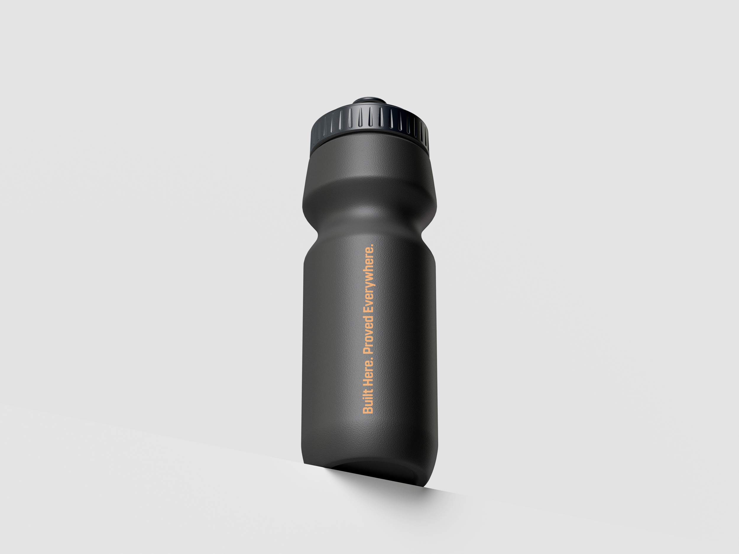
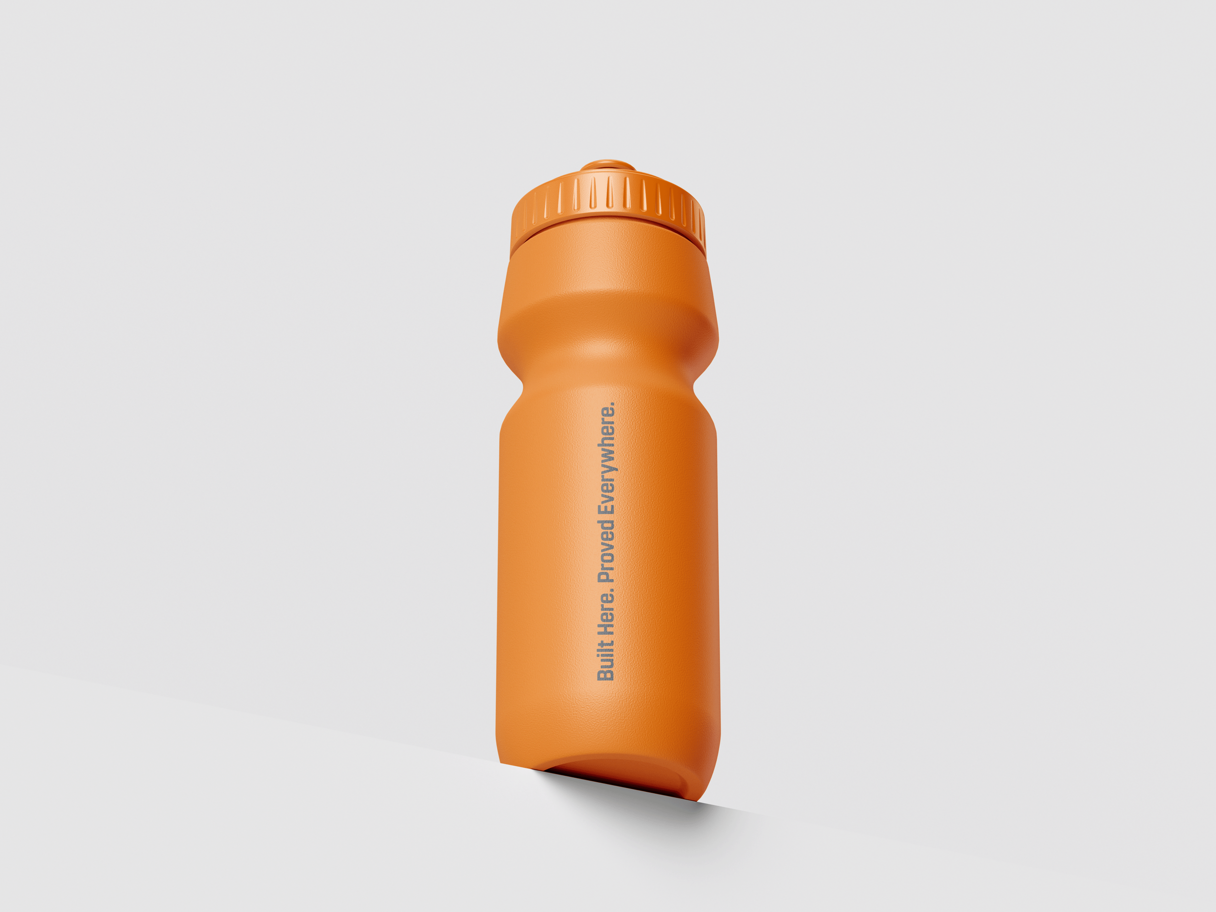
The black ground gives the mark room to breathe and adds to the heaviness the brand demands. Orange carries the energy. White holds the structure. The condensed bold wordmark sits with a full stop, a finishing gesture that makes the name feel like a statement rather than a label.
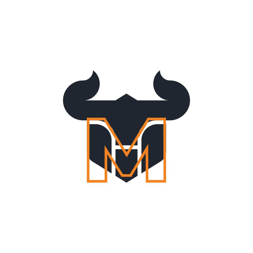
M as the main alphabet from brand name.
The Process
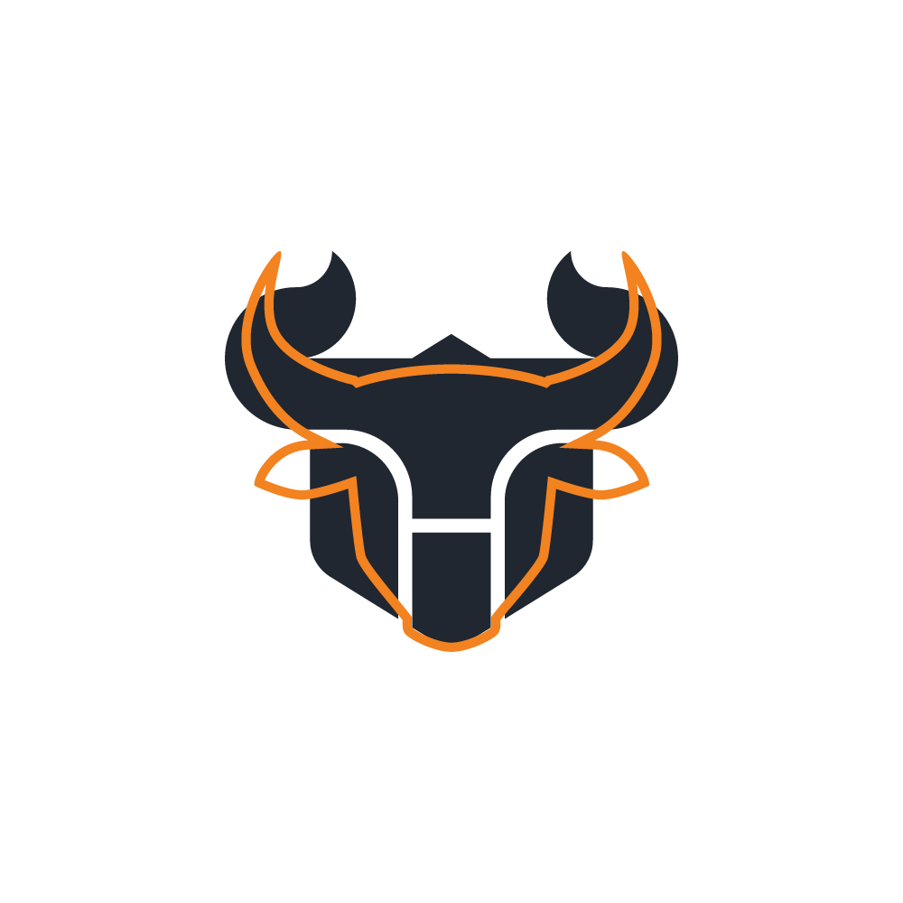
The shape of the Bull head as main mascot.
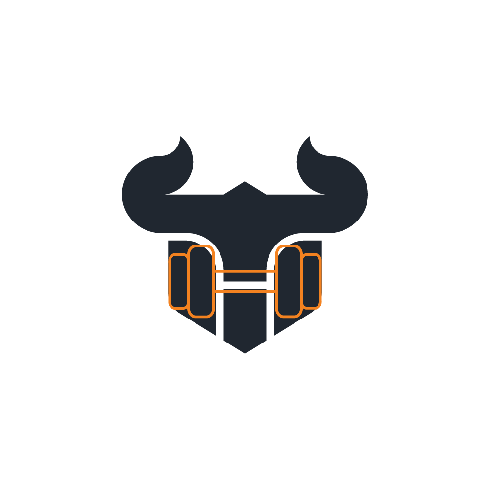
Gym Equipment as the connected brand use.
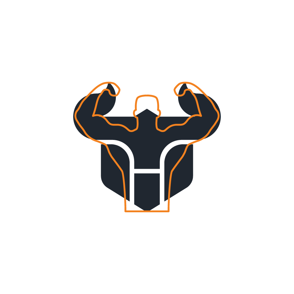
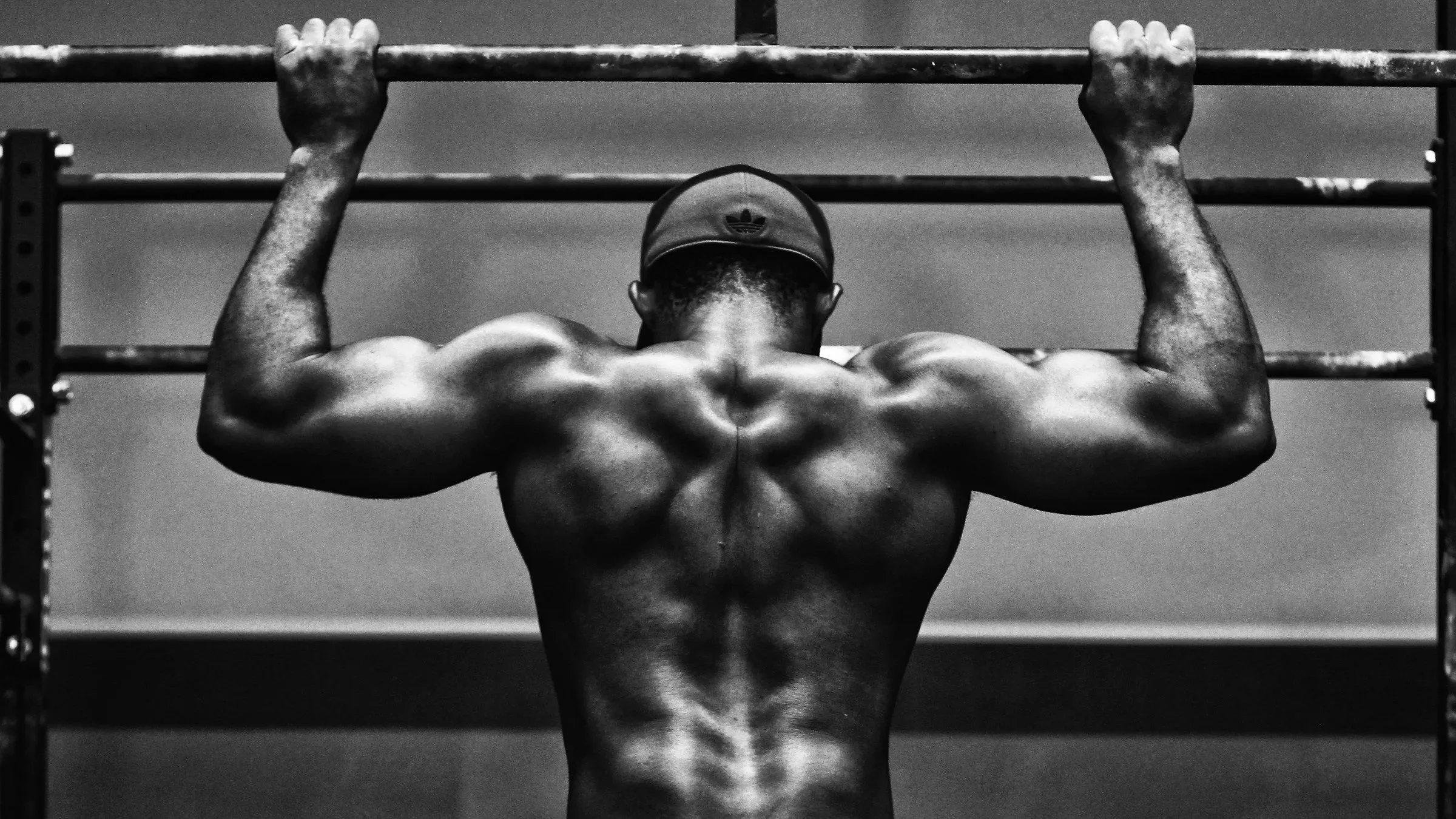
Bodybuilding Performance as the connected activity.
Brand Language
*
Brand Language *