School Of Fitness
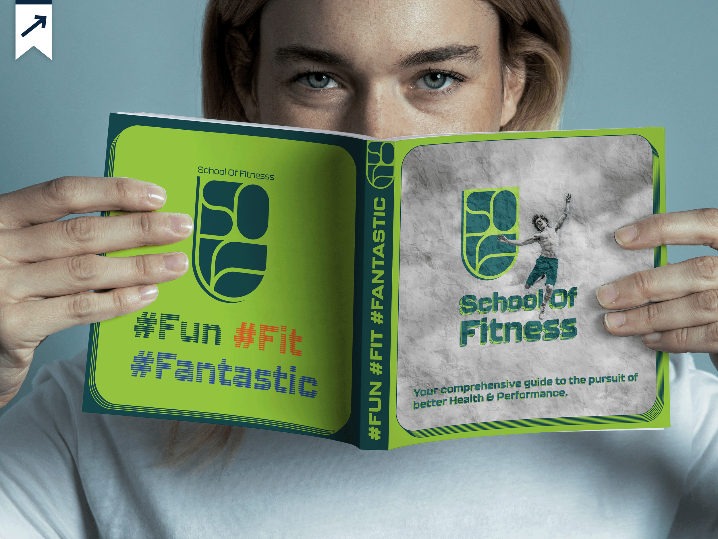
The School of Fitness manual began with a blank brief. The name, the logo, the tagline, the format, and the color system were all developed before layout began.
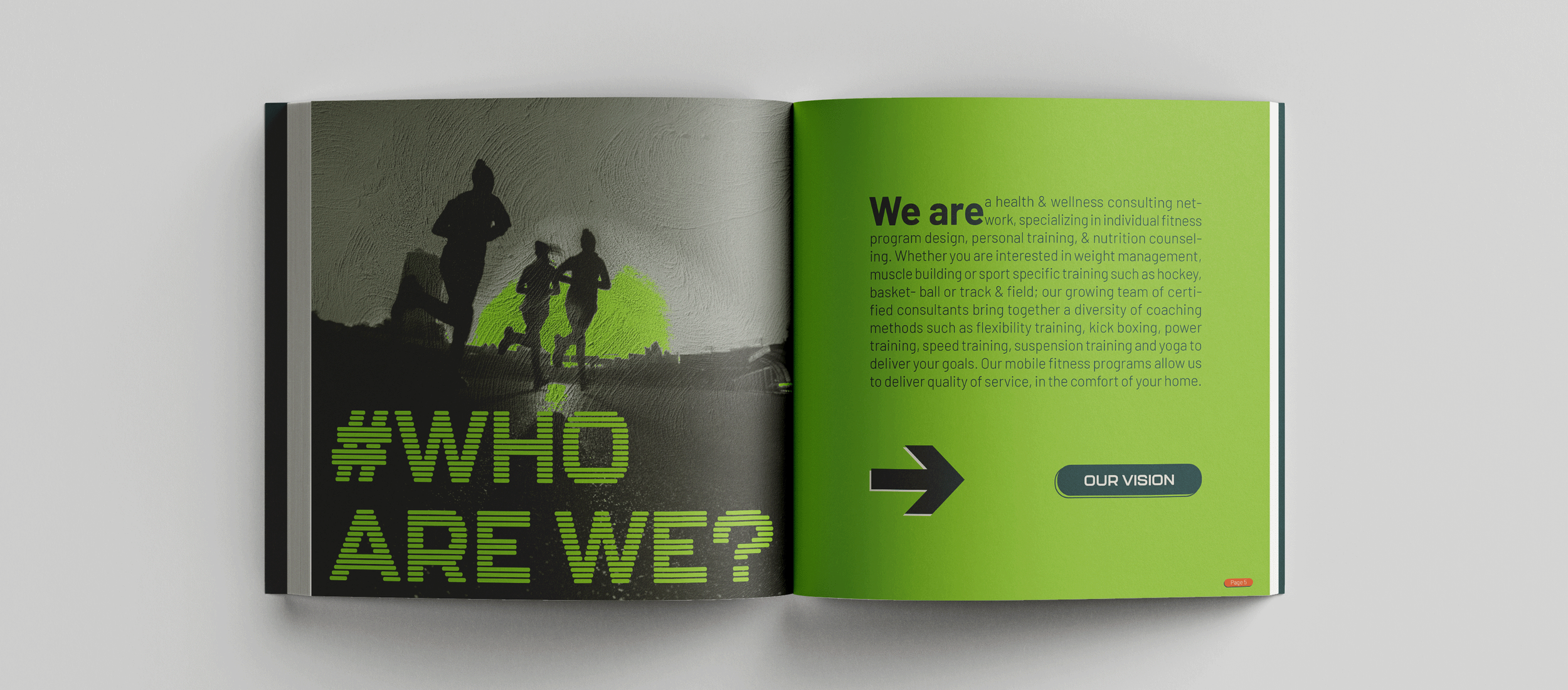
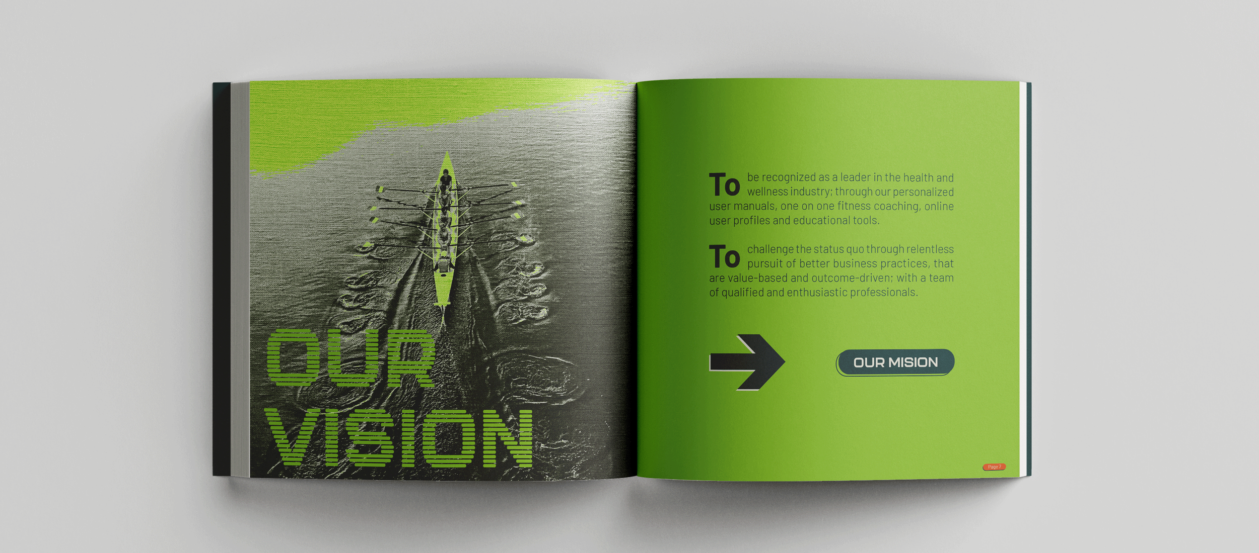
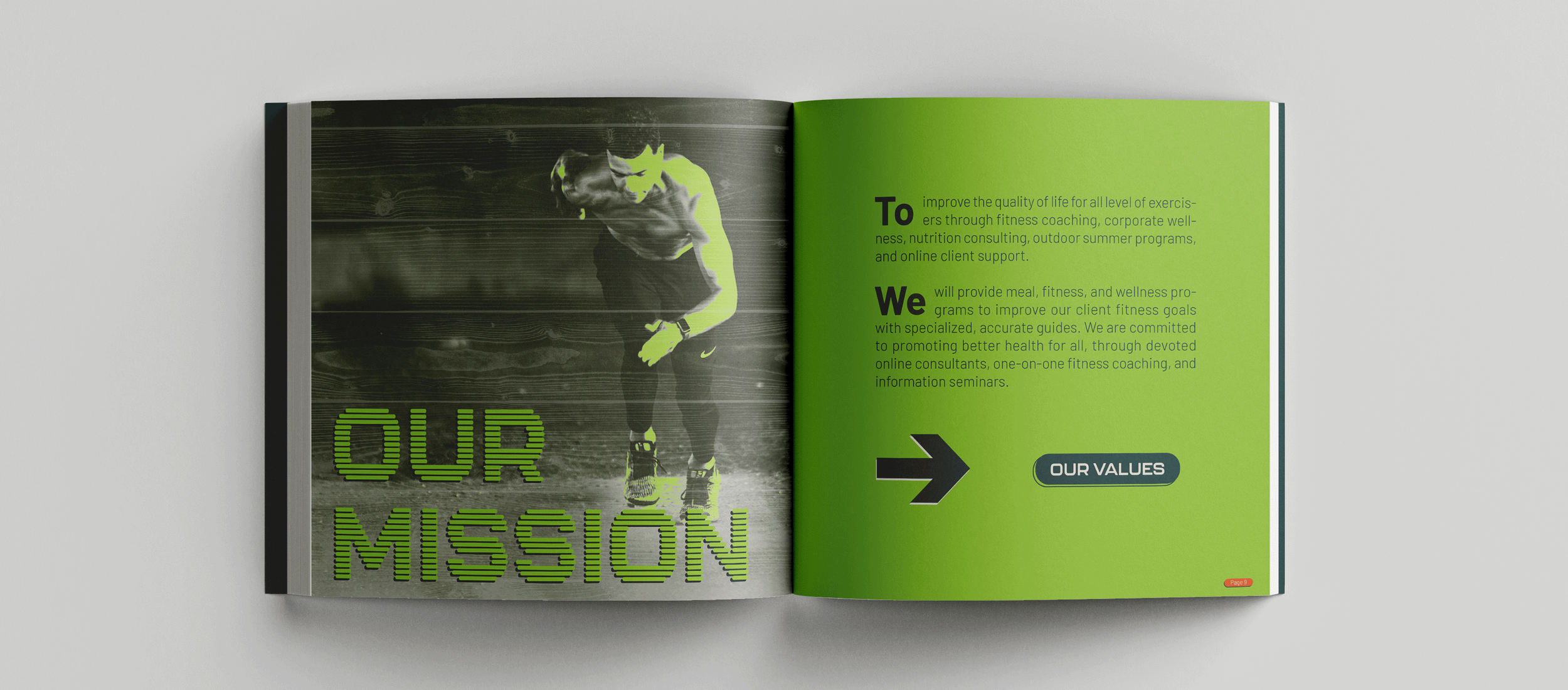
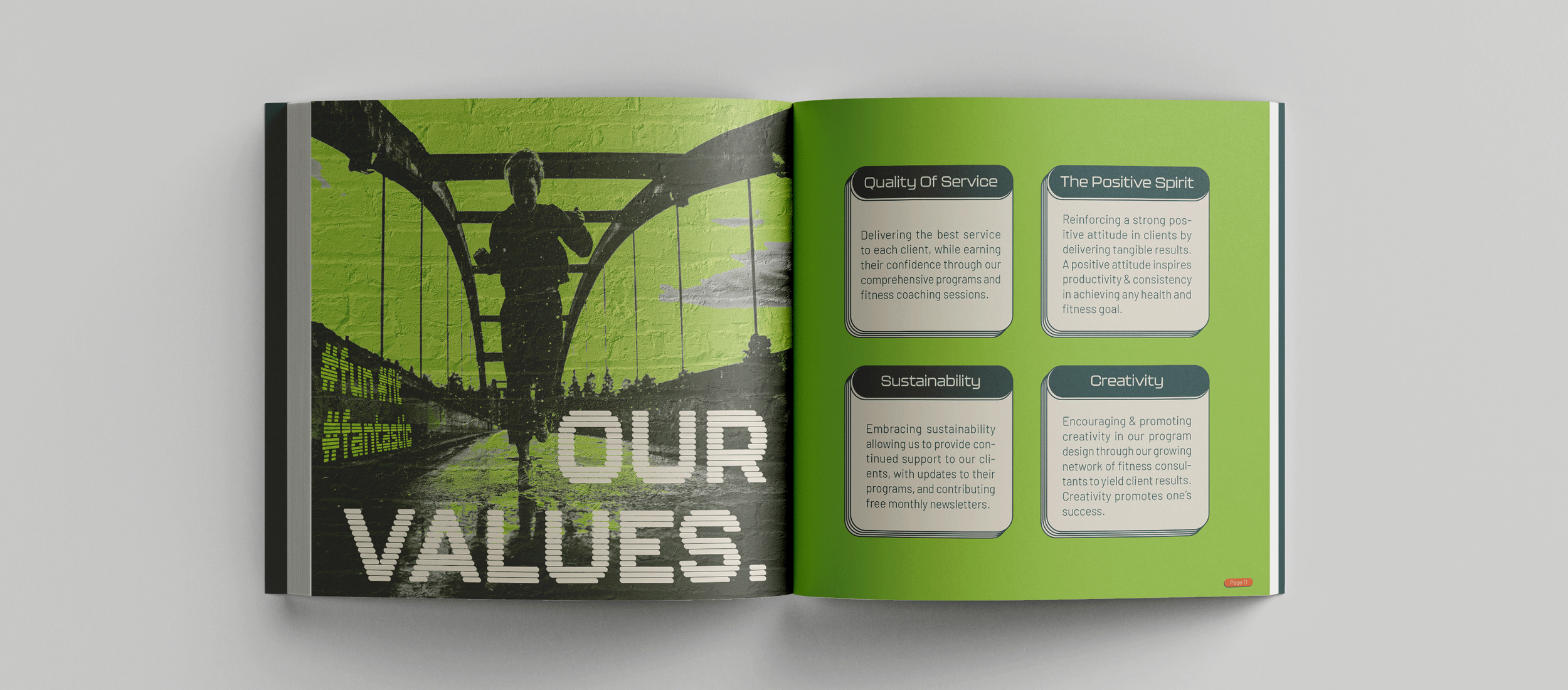
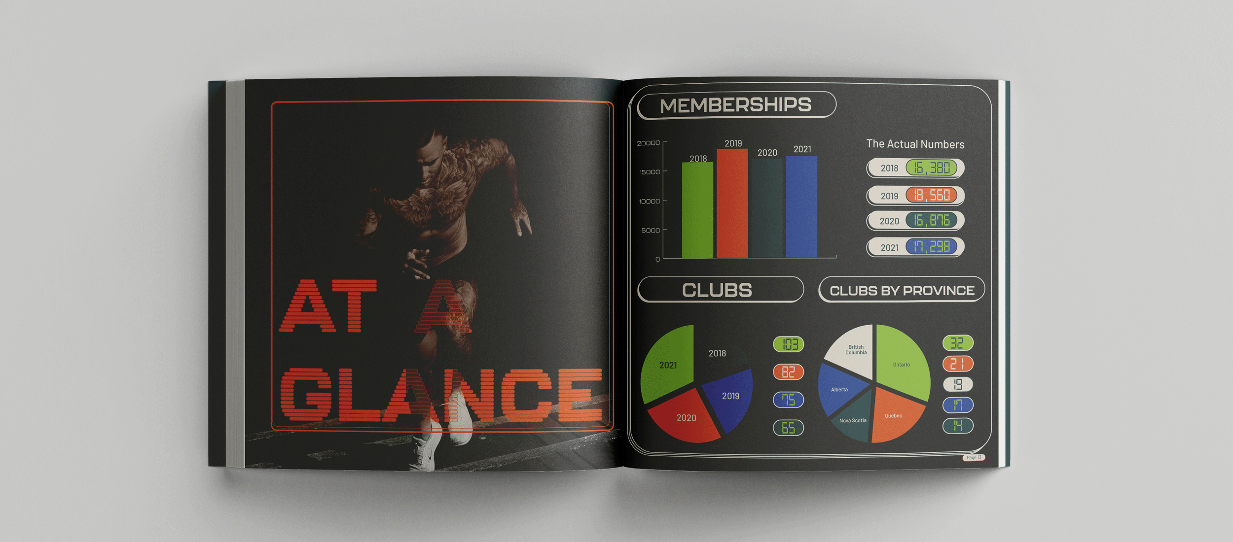
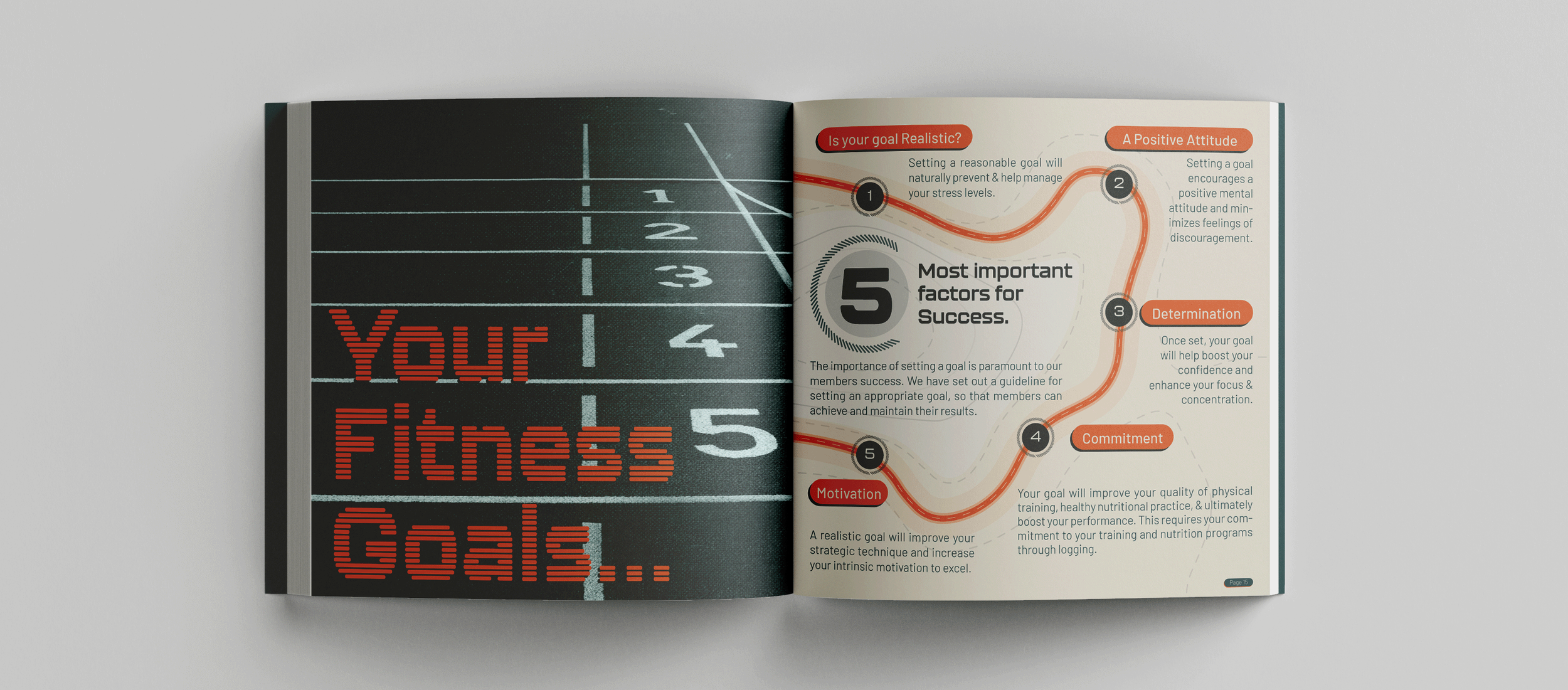
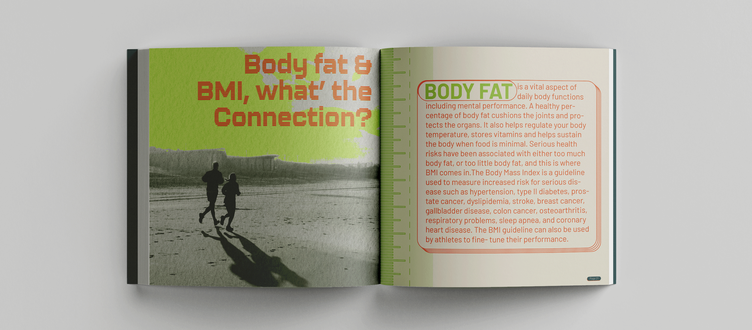
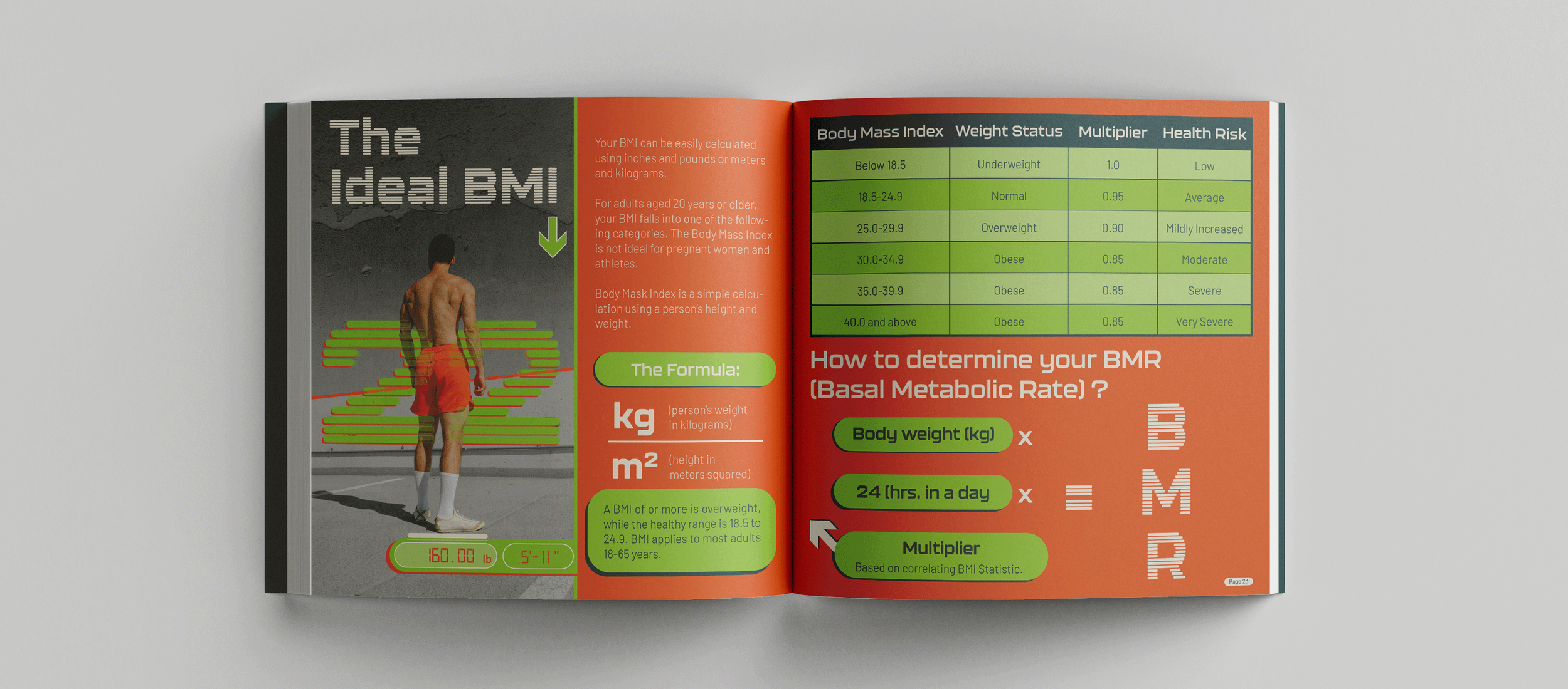
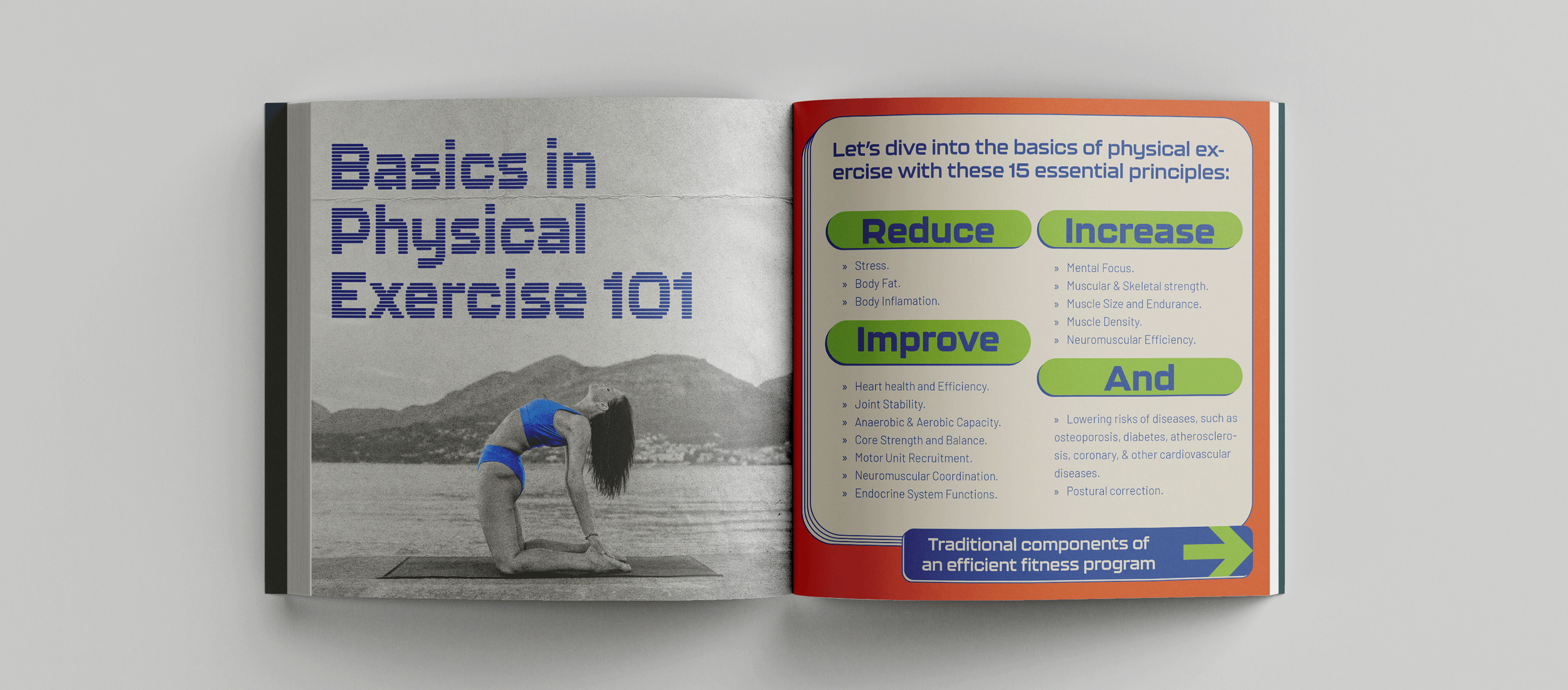
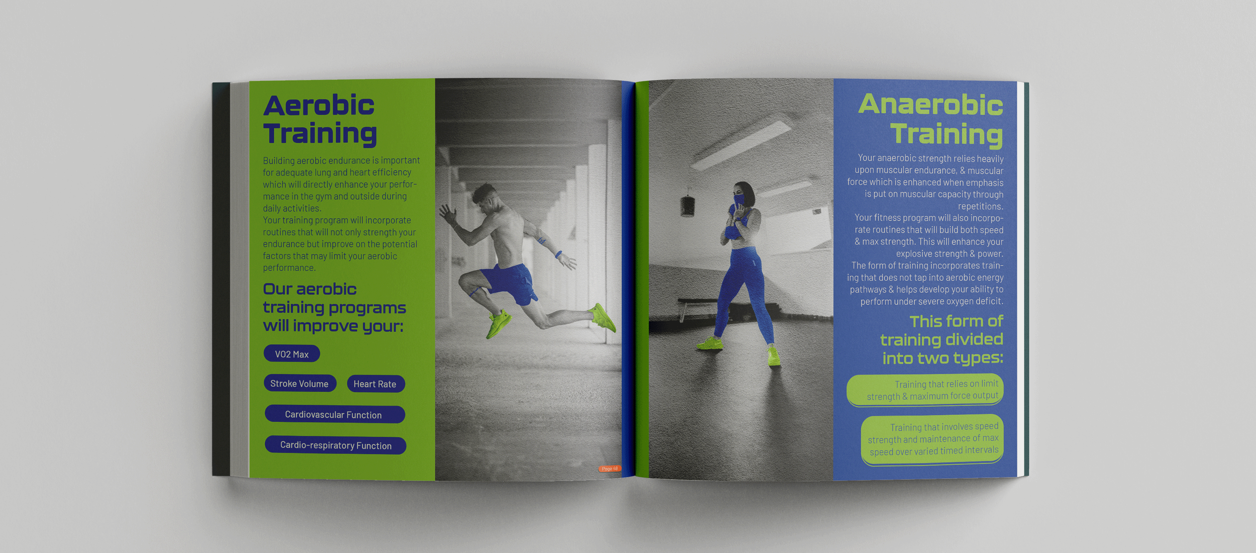
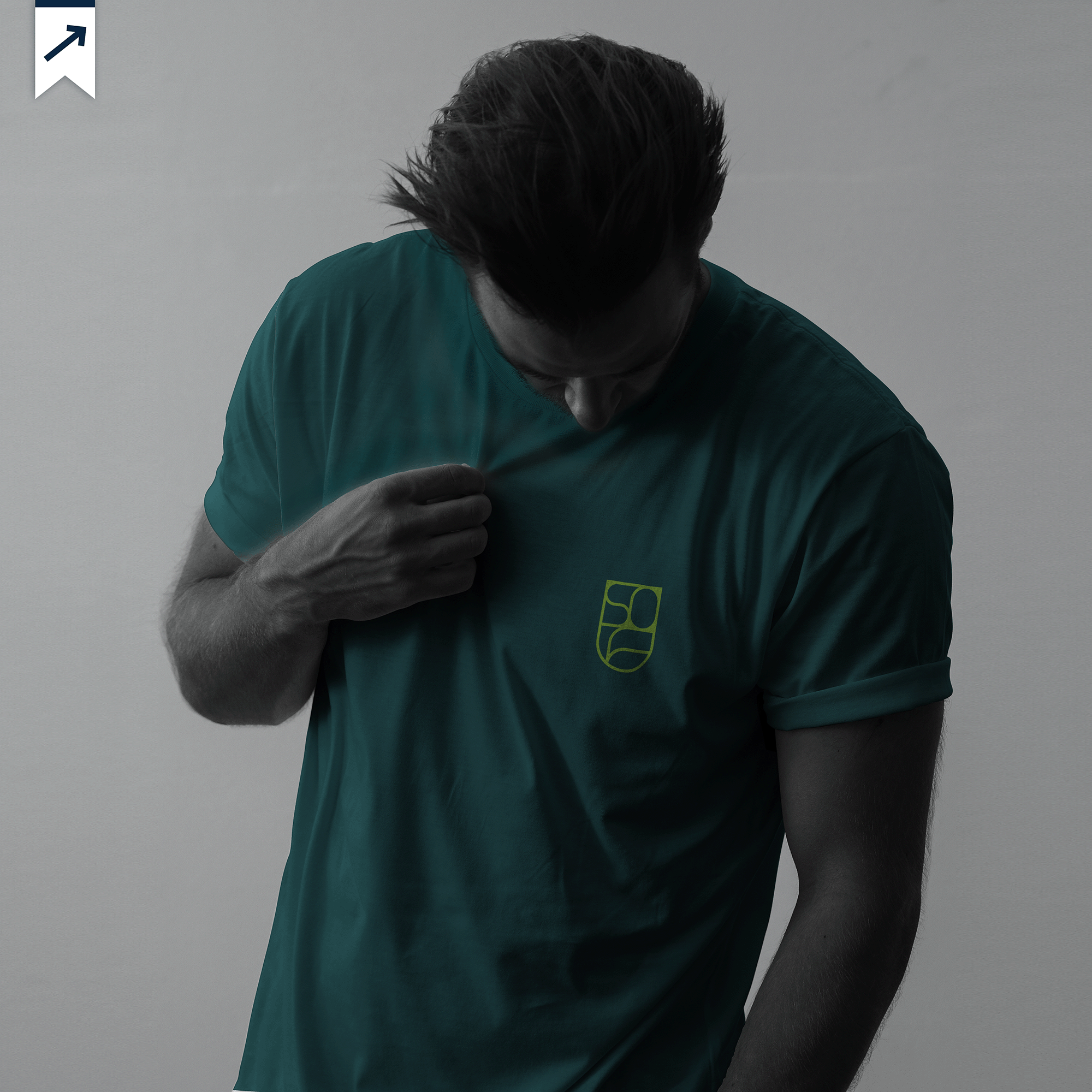
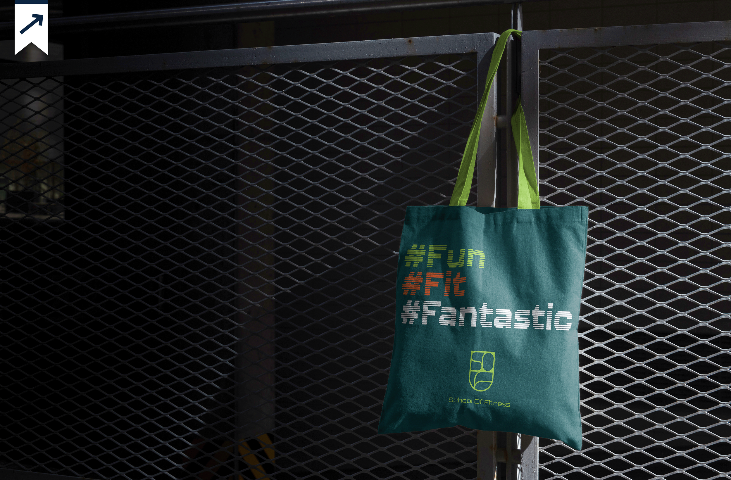
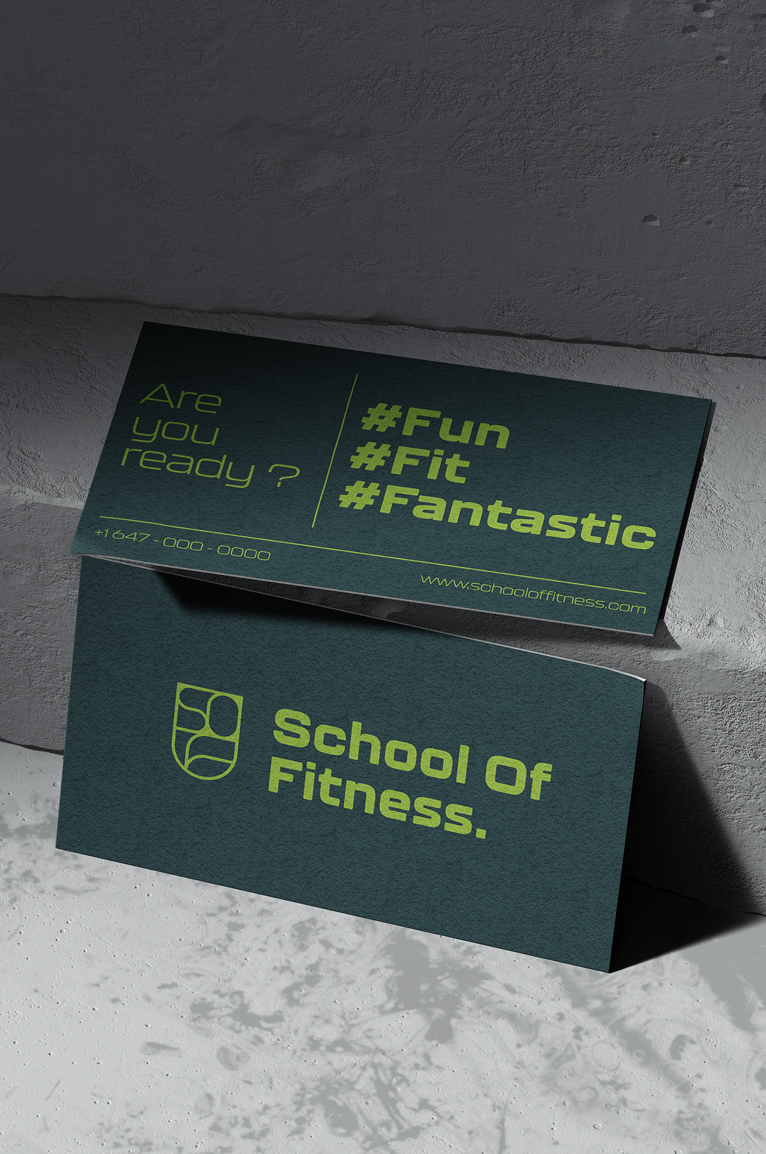
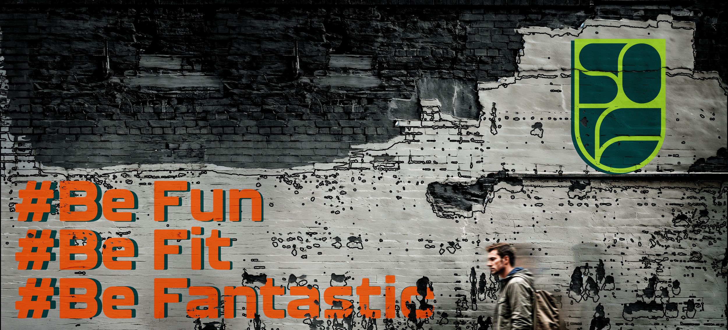
The square format was a deliberate choice. The brand identity was built around Triple F, Fun, Fit, and Fantastic, with a target audience of young people and a visual language split across three colours. Green, blue, and orange each carried a meaning: the cooler tones representing consistency and discipline, the warmer tones representing nutrition and energy.
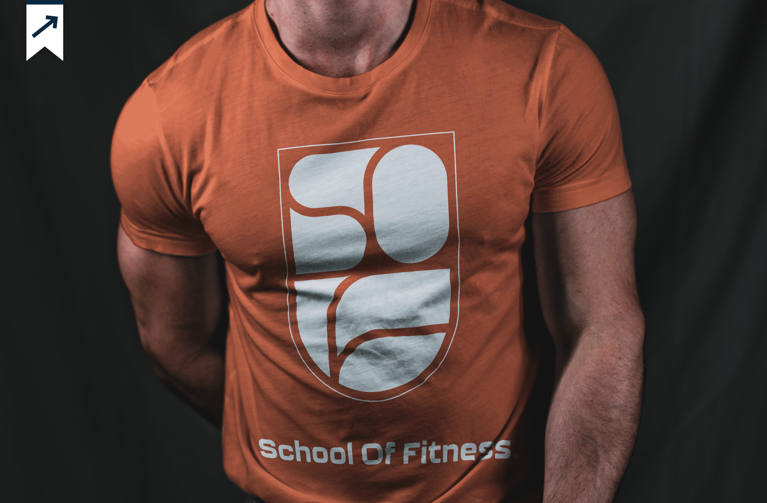
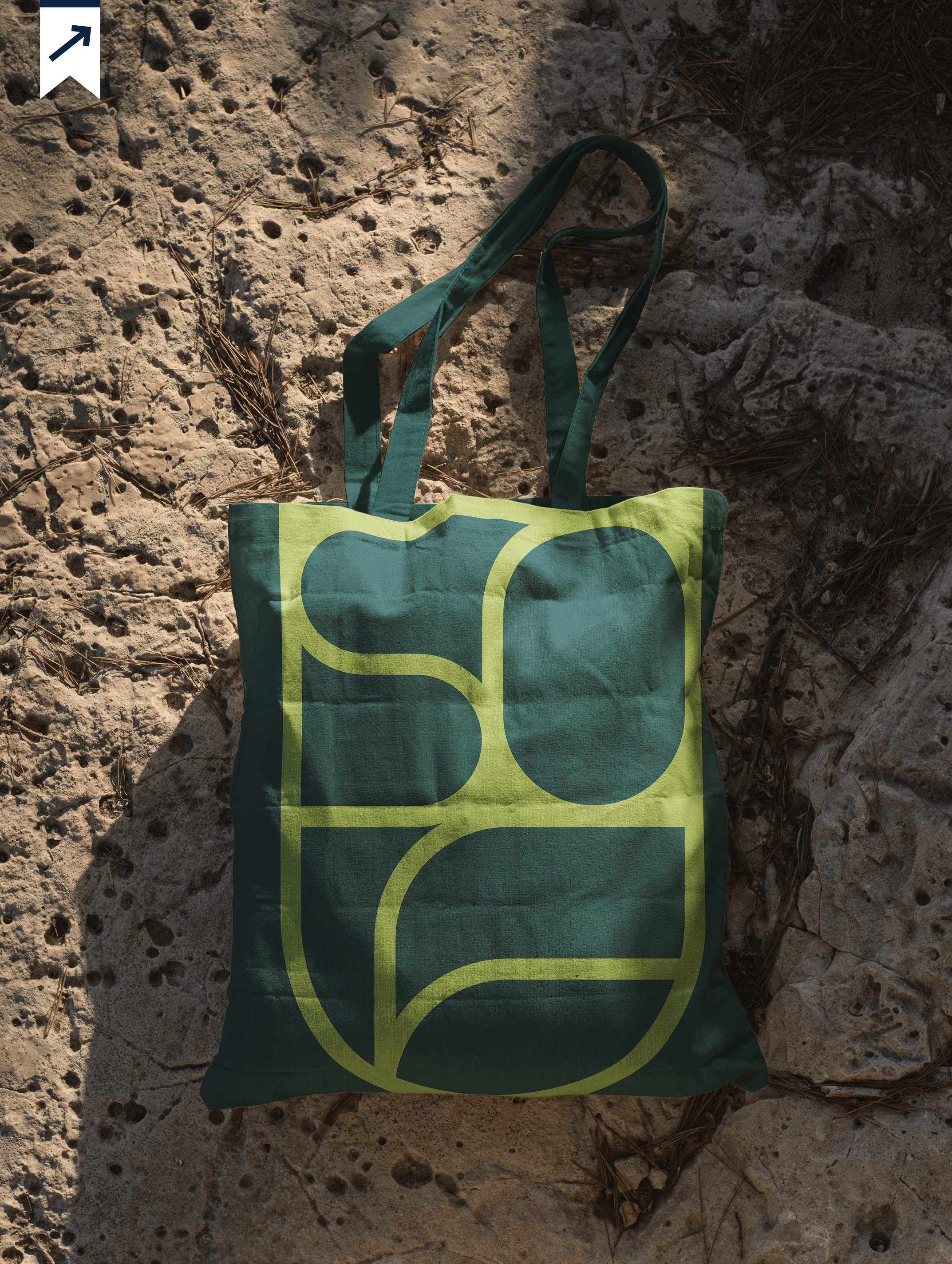
The central concept was the button. A UI element from digital interfaces and a tactile embossed object from print production. Both pressable, both purposeful, both asking for interaction. That single idea connected the digital and physical versions of the manual into one coherent design language.
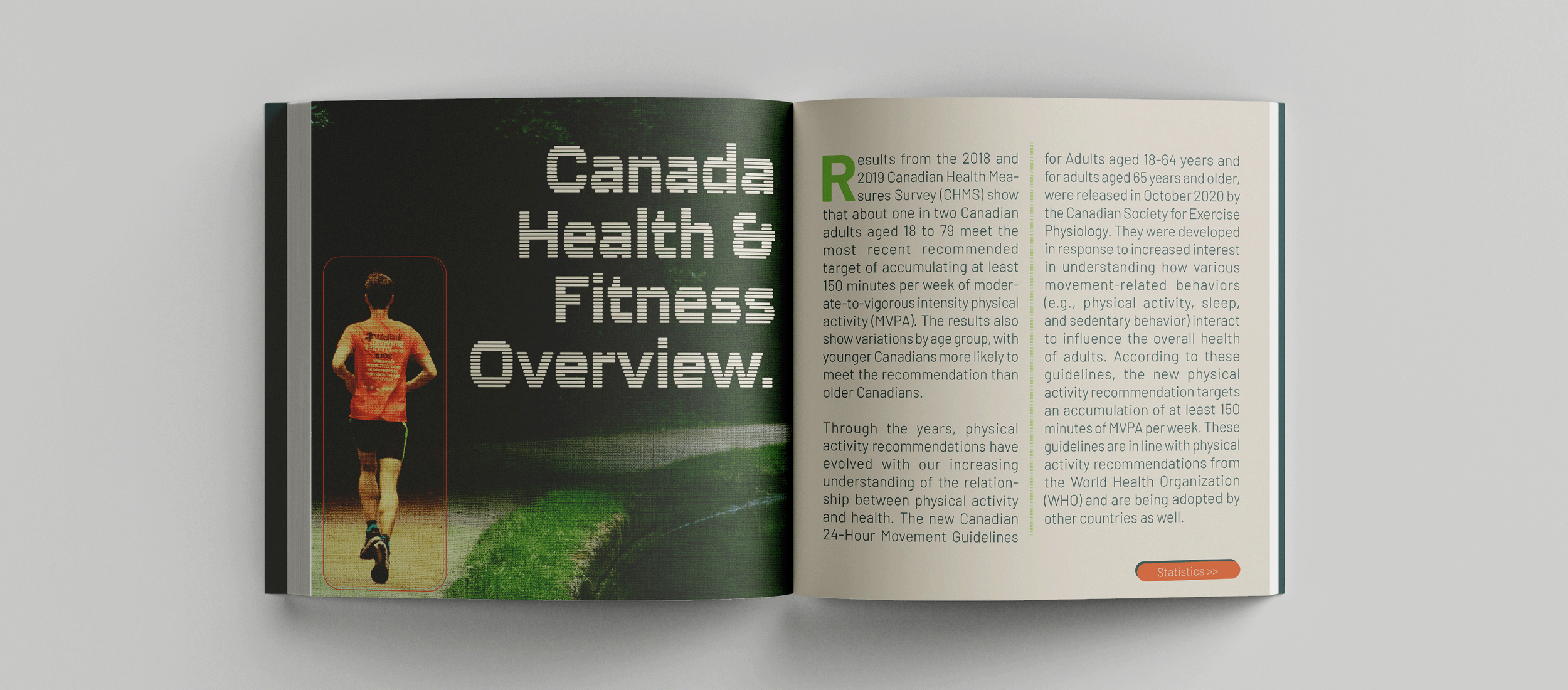
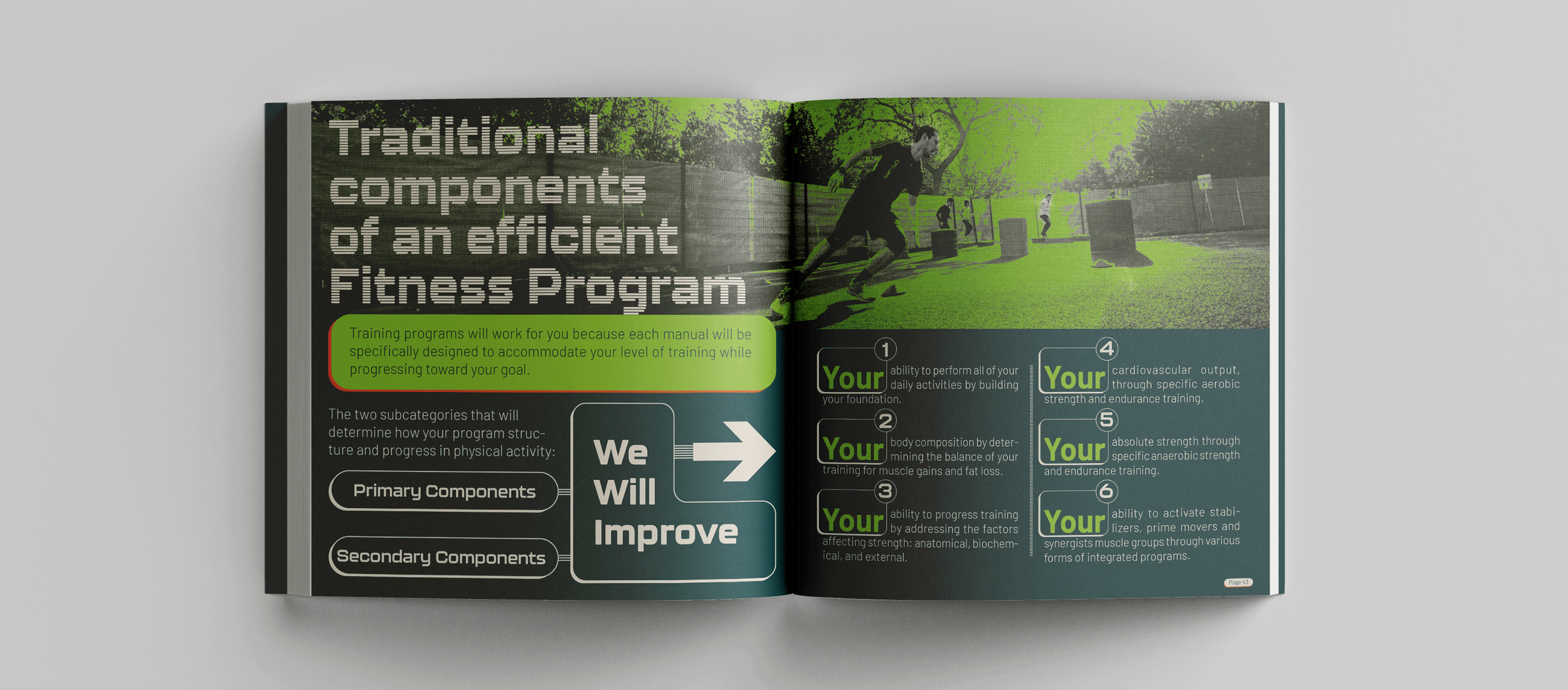
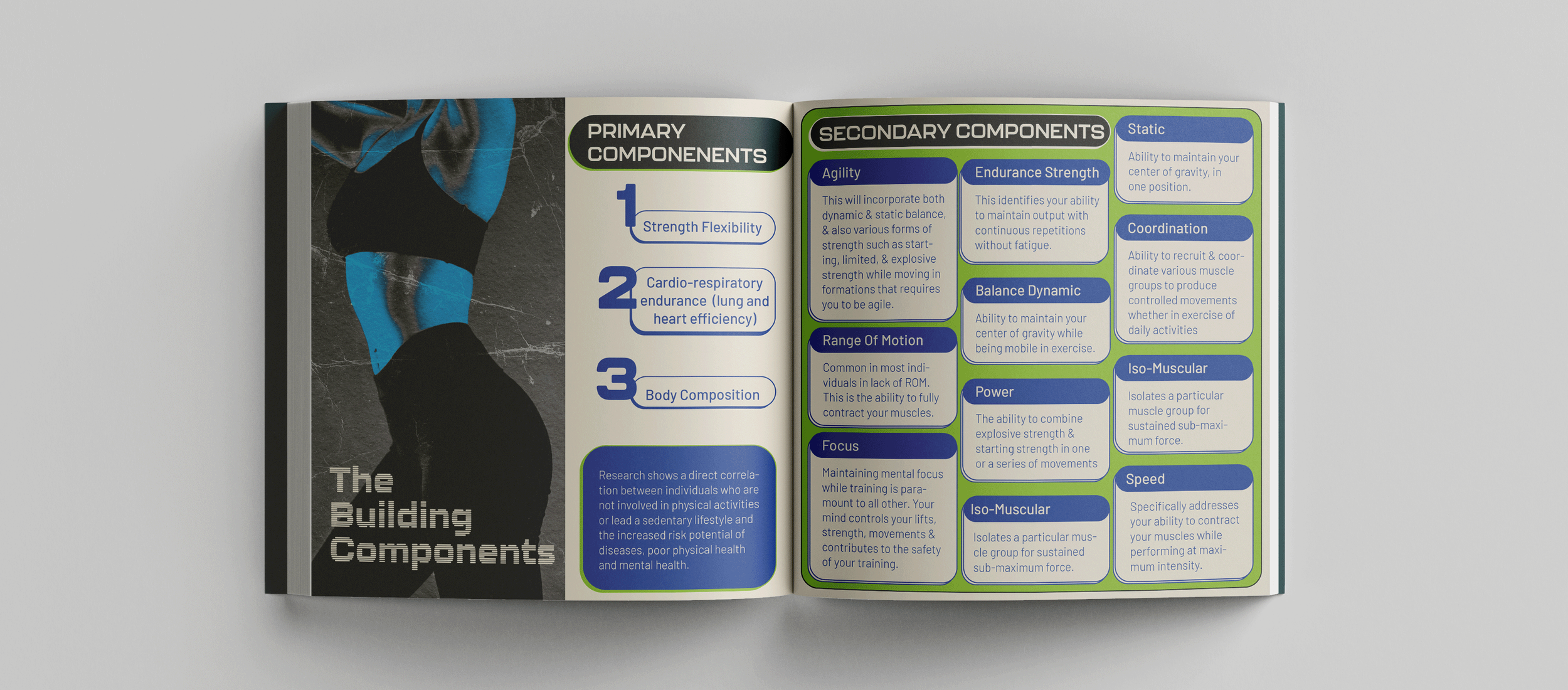
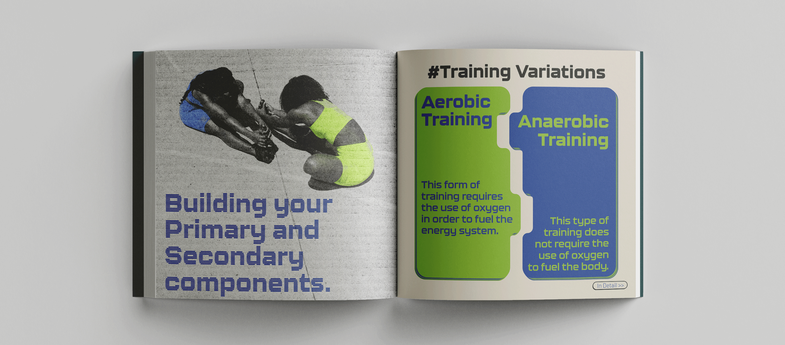
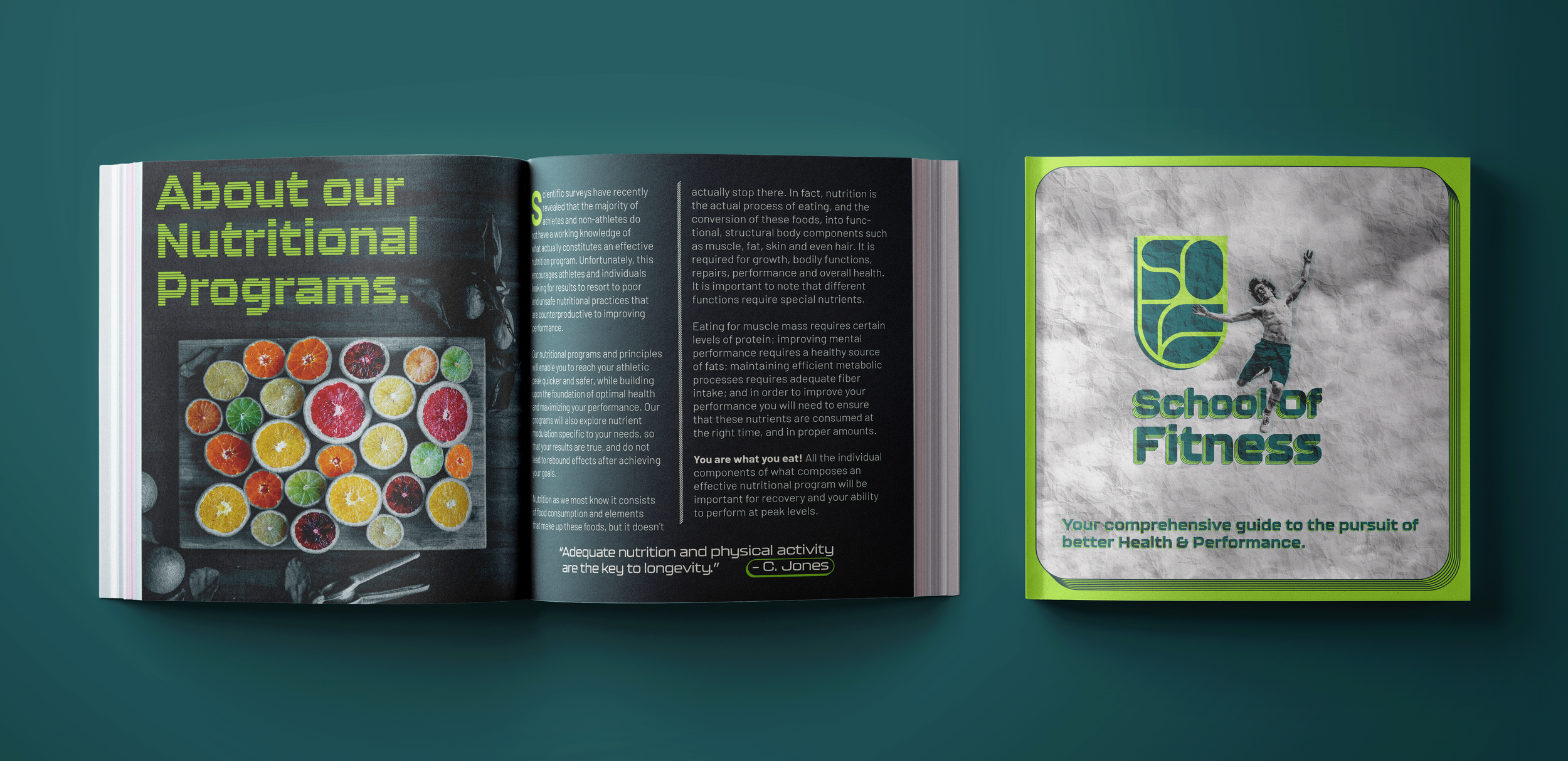
Every section had its own page architecture. Each chapter cover was a Photoshop edited black and white textured poster, brick, wood, concrete, chosen to reflect the tone of the content it introduced. The textures sat alongside the solid brand colors, creating a rhythm between the raw and the refined throughout the document.
The production system was built for efficiency. Photoshop files were linked and embedded directly into InDesign rather than exported, so every change refreshed across the full document instantly. Every heading, every subheading, and every content block had its own considered layout, and every layout decision connected back to the brand it was built for.
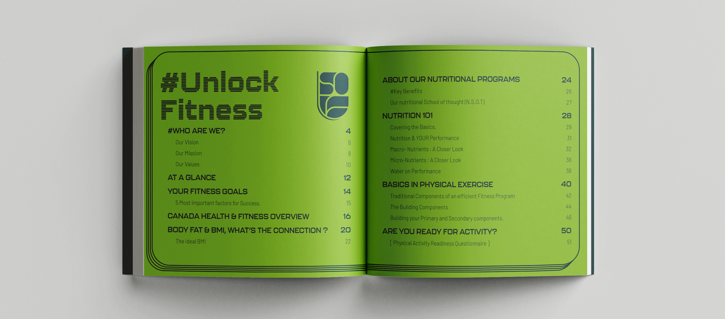
Manual Spreads
Format : Digital & Print | Pages : 52 Nos | Size : 9”x9”